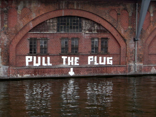
Between the Jannowitzbrücke and Ostbahnhof.
Henning Krause’s work is so awesome. Nobody knows that I look at Henning’s work every day and feel happy and jealous at the same time. In fact, Henning’s custom signage type for Deutsche Bahn is the first face that I ever saw in the environment and somehow knew that it wasn’t an off-the-shelf font. Probably because Helvetica just doesn’t look that good. (Nothing against Helvetica… more about her down below).
Whenever anyone says anything bad about Henning’s work, I get mad. I have only met Henning once, for about two minutes at last year’s TYPO Berlin, but I feel an affinity for his typefaces anyway. At the moment of this writing, I’m sitting in Henning’s lecture at TYPO Berlin 2007. I am not the most active of the bloggers here. I knew that I would be topped by Ivo and Jürgen before I even arrived in Berlin. Heck, Jürgen started his prolific coverage of the conference the day before it began. Even if you can’t read German, you should read the FontBlog. Or at least look at it, or Babelfish it, like I do with Typographe.com…
When I arrived at the conference hall this morning, I instinctively dialed-up Fontwerk.com and FontBlog.de. I got up early to color-correct my photos from yesterday, and I wrote my first text while Anke was in the shower. I only got internet access once I arrived in the hall, however.
Other things worth mentioning…
I’m currently involved with my fourth issue of Slanted. I’ve have several folders worth of e-mails from the editor-boss, Thomas Mettendorf, but until today, I never met him. Now I have. His website is worth a look.
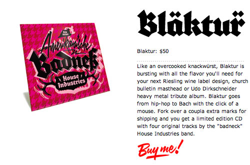
So much did I enjoy last night’s House Industries performance that I had to buy their CD. FontShop has it for 30 Euros. Everyone reading this who is still at the conference should go to the FontShop booth right away and buy it, too. The four awesome tracks even come with a neat Koch’sche blackletter, Blaktur. I’ll never use the font, but I needed these tracks.
Yang Liu is awesome, but I’m going to have to miss her lecture. It comes up over the next hour. I remember her lecture from two TYPO Berlin’s ago, and I’ve had the privilege to be able to follow some of her work over following years.
Helvetica: 50 years

Neue Haas-Grotesk came into the world in 1957. Linotype is celebrating Helvetica’s 50th birthday in ernest (even though the typeface has only been called Helvetica since about 1961). Coinciding with this conference, Linotype is kicking off a poster contest. Everyone has until October 4th to enter. More info here. Also, until June 30th, customers who purchase the entire Neue Helvetica family from Linotype.com can have the opportunity to only pay half! Details…
Of course, tomorrow night in Cubix, the Helvetica film will celebrate its Berlin premiere. This will also be the first time that I’ll have seen the film, and I’m already shivering with anticipation.