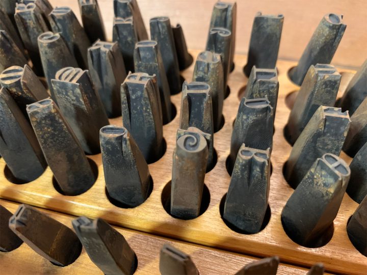
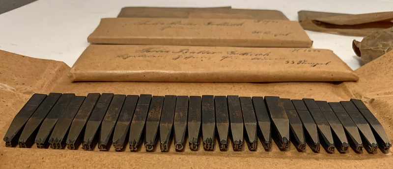
Above, I have reproduced my photograph showing part of Stiftung Deutsches Technikmuseum Berlin, inventory number 1/2018/0342, drawer 28. In it, you see the steel typographic punches for the 28-pt (and maybe a few 24-pt) sizes from one of the Reichsdruckerei typefaces. The design’s name is Diplom-Gotisch and the punches were probably cut in Berlin, ca 1893.
This is the second post in a two-part series about the typographic punch collection from the West German Bundesdruckerei acquired by the Museum für Verkehr und Technik Berlin during the 1980s. Today, those punches are part of the Stiftung Deutsches Technikmuseum Berlin’s collections. All the punches came to the Bundesdruckerei from its predecessor institution, the German Reichsdruckerei, established in the 1870s after Rudolf von Decker’s former Court Printing House fused with the Prussian State Printing Office. While there is no count of the total number of punches in this collection, the figure must easily be higher than 10,000. Many were cut at the in-house typefoundry inside Decker’s printing house. Some were cut later, inside the Reichsdruckerei. Others were acquired from external sources. For example, some of the punches I mentioned in my last post came from the Royal Prussian Academy of Sciences. In turn, some of those had originally been commissioned from the Berlin-based punchcutter and typefounder Ferdinand Theinhardt.
A recap about this typographic-punch collection
In my last post, I explained that the Stiftung Deutsches Technikmuseum Berlin’s typographic punch collection was divided between two locations. At each site, punches are stored inside purpose-built cabinets constructed at either the Bundesdruckerei or the Reichsdruckerei. The larger cabinet is held in the museum’s off-site storage depot. The smaller cabinet is part of the museum’s printing exhibition. The larger cabinet primarily holds punches for roman and italic typefaces, as well as the punches for Reichsdruckerei typefaces in other scripts/writing systems, and the punches for printing rules and ornaments. The smaller cabinet has the printing office’s punches for blackletter typefaces, as well as what might be “spillover” from the larger cabinet. Since most of the Reichsdruckerei’s new typefaces were blackletter, those punches are in the small cabinet.
Although the smaller cabinet is easer to see – being part of a museum exhibition – its contents are harder to get access to. To prevent museum visitors from opening the drawers and disturbing or damaging their contents, the smaller cabinet’s drawers are screwed shut. I am very grateful to the museum staff (especially Kerstin Wallbach, curator of the printing exhibition) for making it possible for me to access those punches, just as they had made it possible for me to view the larger cabinet stored in their off-site depot. I was also pleased to have company when I got to see the smaller cabinet’s contents: Nikolaus Weichselbaumer from the University of Mainz was also in the museum to look at these punches. Nikolaus has published on the Decker printing office’s history and its contributions to neoclassical typography. He and I were in the museum on November 4th – a Monday – a day when it was closed to visitors.
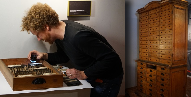
Above, I’m squinting and looking at punches through Nikolaus’s magnifying glass with one eye. This is what I do on my vacation days from LucasFonts! In this collage, the wooden cabinet and I are not shown at the same scale. While I keep referring to this cabinet as the “smaller” one, it is actually quite large: the cabinet is taller than an average-sized adult and as wide as two people standing side-by-side. Both photos are from the Stiftung Deutsches Technikmuseum Berlin.
Reichsdruckerei typefaces and their punches
With this post, I want to focus on the twenty-three or so new typefaces produced inside the Reichsdruckerei’s in-house typefoundry. In my last post, I explained that I compared the punches – and the inventory cards kept with each type size’s punches – with type specimen catalogs from the Decker printing office and which the Reichsdruckerei itself printed. Aside from the museum’s smaller punch cabinet itself, most of the information in this post comes from the following sources:
- Crous, Erst: Fünfzig Jahre Reichsdruckerei 1879–1929. Mit einem Rückblick auf den Berliner Buchdruck für Hof und Staat bis zur Begründung der Reichsdruckerei. Verfaßt und herausgegeben von der Direktion der Reichsdruckerei unter Mitwirkung von Dr. Ernst Crous. Mit zahlreichen Abbildungen in verschiedenen Druckverfahren nebst einem Wasserzeichenblatt. Gedruckt und verlegt von der Reichsdruckerei, Berlin 1929. Pages 233–240. Reprinted as a supplement to: Bockwitz, Dr. Hans H. (ed.): Archiv für Buchgewerbe und Gebrauchsgraphik. Vol. 68, no. 7 (July 1931). Verlag des Deutschen Buchgewerbevereins, Leipzig 1931
- Ovink, Gerrit Willem: “‘Grandeurs and Miseries of the Punch-Cutter’s Craft,’ a review of A tot Z. Een autobiografie van P.H. Radisch, staal-stempelsnijder.” In: Quaerendo, 10. Amsterdam 1980. Pages 164–172.
- Radisch, Paul Helmut: A tot Z. Een autobiografie van P.H. Radisch, staal-stempelsnijder. De Priegelboekerij, Haarlem 1979
- Schiller, Georg: Probesätze der Druckschriften, welche in den Jahren 1892–1912 nach Entwürfen von Prof. Georg Schiller geschnitten wurden. Zusammengestellt aus Anlass der Internationalen Ausstellung für Buchgewerbe u. Graphik, Leipzig 1914. Georg Schiller, Leipzig 1914
From the beginning – until sometime in about the 1930s – the Reichsdruckerei created bespoke typefaces. They did this even though there were dozens of commercial typefoundries within Germany that could have created new products for them (and indeed, the Reichsdruckerei also purchased cast fonts of type from commercial foundries, and probably purchased duplicate matrices of various typefaces, too). Several of the original typefaces the Reichsdruckerei produced can be classified as being so-called »Künstlerschriften«, meaning that they were designed by a person who had already achieved some sort of notoriety in the graphic arts, and after whom the typeface was named.
According to Ernst Crous’s essay, the Reichsdruckerei cut and cast twenty-one typefaces between 1883 and 1928. And at least two more typefaces were produced after Crous wrote his text: the Tobias-Schwab-Antiqua and Tobias-Schwab-Kursiv, designed for the Reichsdruckerei by Karl-Tobias Schwab. These raise the typeface count to twenty-three. It is possible that the Reichsdruckerei made even more typefaces after the early 1930s, but I did not found any evidence for this in the Bundesdruckerei cabinets at the Stiftung Deutsches Technikmuseum Berlin.
Several Reichsdruckerei typefaces had multiple weights – such as a regular, bold, or heavy style. Counting those increases the count past twenty-three significantly. Almost all Reichsdruckerei typefaces were produced in a range of type sizes, often beginning at the very small Perl (5 Didot points). In addition to being cast by the Reichsdruckerei, Georg Schiller’s Neudeutsch was also distributed by the commercial typefounders J. John Söhne of Hamburg and C.F. Rühl at Leipzig; however, I believe that all other typefaces on the following list were exclusive to the Reichsdruckerei, and were not sold to other printers.
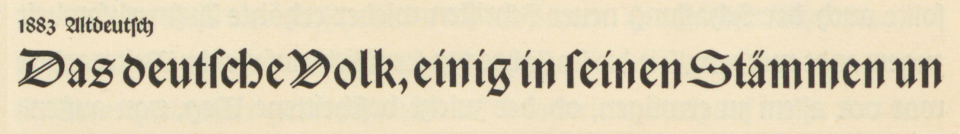
Altdeutsch: Produced at the Reichsdruckerei in eight sizes (10 through 36 Didot points). This may have been designed by Reichsdruckerei personnel, too. The only typographic materials for this typeface in the Bundesdruckerei cabinets are the steel punches for its 16-point size. According to Crous, only typefaces whose sizes were 12-point or smaller were being cut by hand in steel at the Reichsdruckerei by 1929 – with larger sizes being cut as “patrices” into other metals. Matrices from those “patrices” would have been made electrochemically via an electrotyping process, while steel punches would be used to strike copper matrices directly instead. Altdeutsch’s sizes above 16-pt size may have been cut into soft-metal patrices; that is one possible explanation for their not being present in the museum’s Bundesdruckerei cabinets.
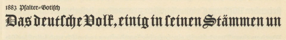
Psalter-Gotisch: This is the Reichsdruckerei’s “Old English”-style textura – in other words, a typeface based on early printing texturas from the Low Countries. »Gotisch« literally means “gothic,” but in typographic contexts, it is usually the German-language term for textura-style types. The Bundesdruckerei cabinets contain this typeface’s punches for the sizes 12, 14, and 16 pt.
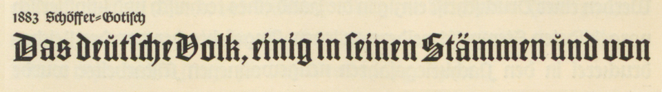
Schöffer-Gotisch: According to Crous, this typeface was cut in one trial size in 1883. For one reason or another, it was put on hold after that. In 1902, the design was produced in six sizes after being revived by Ansgar Schoppmeyer. These ranged from 16 through 54 Didot-points. There are no traces of this typeface in the Bundesdruckerei cabinets at the Stiftung Deutsches Technikmuseum Berlin. The typeface is presumably named after Peter Schöffer the elder, of Fust & Schöffer fame.
Initialen: This set of broad pen-style ornamented initials was produced by the Reichsdruckerei in 1884. According to Crous, the Reichsdruckerei cut its initials directly into soft metals for matrix-making via electrotyping, which would eliminate the need for steel punches. If these initials were indeed produced that way, it could explain why there are no materials for them in the museum’s Bundesdruckerei cabinets. Further investigation into the Museum für Druckkunst Leipzig’s collection of Bundesdruckerei matrices could shed light into how these initials were made.
Initialen: This set of broad pen-style ornamented initials was produced by the Reichsdruckerei in 1885. Like the initials of 1884 shown above, these are designed in a “Renaissance” style, similar to the sets of initials being produced in the 1880s by numerous typefoundries in German-speaking countries. See my explanation of the term “Renaissance” in my caption for the Renaissance-Gotisch typeface below.
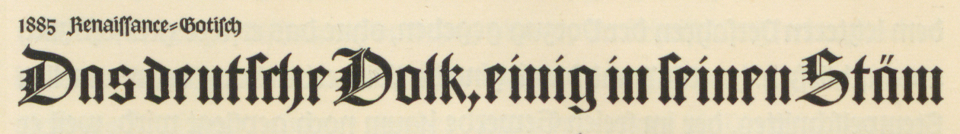
Renaissance-Gotisch: Produced at the Reichsdruckerei in five sizes (28 through 54 Didot points). This may have been designed by Reichsdruckerei personnel, too. The materials for this typeface in the Bundesdruckerei cabinets are not complete; only three sizes are present. These are the steel punches for the typeface’s 28-pt size, as well as the lead patrices (»Bleioriginalen«) for the typeface’s 32 and 40-pt sizes. The “Renaissance” in the typefaces name refers to the German Renaissance generally – think Albrecht Dürer, etc. – but is probably more specifically referring to the Münchner Renaissance, a historicist movement in the book arts that was then underway in Munich, and inspiring work elsewhere across the country.
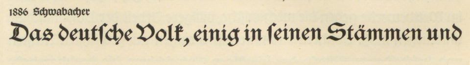
Schwabacher-Gotisch: I don’t know what to say about this typeface. The Reichsdruckerei inherited several Schwabacher typefaces from the Decker printing house, and presumably from the Preußische Staatsdruckerei, too. I have no ready explanation why they cut this typeface in the 1880s, or why they cut the Reichsdruckerei-Schwabacher – shown below – almost a half-century later.
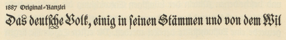
Original-Kanzlei: Produced at the Reichsdruckerei in twelve sizes (12 through 96 Didot points). This may have been designed by Reichsdruckerei personnel, too. The Bundesdruckerei cabinets have the master forms for nine of those sizes, containing steel punches for the sizes 12, 14, 16, 20, and 24 pt. There are also brass patrices (»Originale in Messing«) for the 32, 40, 48, and 60-pt sizes.
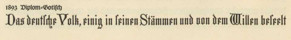
Diplom-Gotisch: Produced at the Reichsdruckerei in eight sizes (10 through 48 Didot points). This may have been designed by Reichsdruckerei personnel, too. The Bundesdruckerei cabinets have materials for seven of those: they contain steel punches for the 10, 12, 14, 16, 20, 24, and 28-pt sizes.
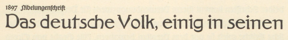
Nibelungenschrift: Designed by Joseph Sattler and produced in one size (Doppelcicero, or 24 Didot points). Created for the Reichsdruckerei edition of the Nibelungenlied. Since the Nibelungenschrift is a roman typeface, instead of a blackletter one, its typographic materials are kept in the Bundesdruckerei cabinet that is in the museum’s off-site storage depot. That has the typeface’s steel punches in it, as well as the brass patrices (»Originale in Messing«) for a set of matching ornamented initial letters.
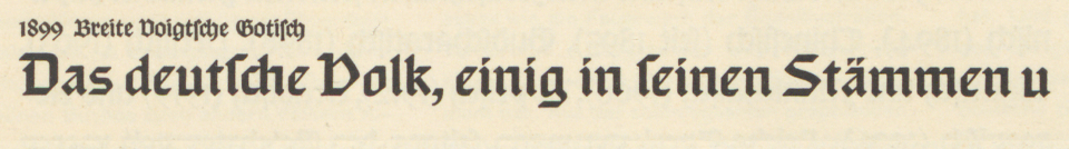
Breite Voigtsche Gotisch: Designed by Professor Paul Voigt, head of the Reichsdruckerei engraving department, who may have also cut the typeface’s punches. It was produced in twelve sizes ranging from 5 through 40 Didot points. The steel punches for the 5 through 20-pt sizes are in the Stiftung Deutsches Technikmuseum Berlin’s Bundesdruckerei cabinets.
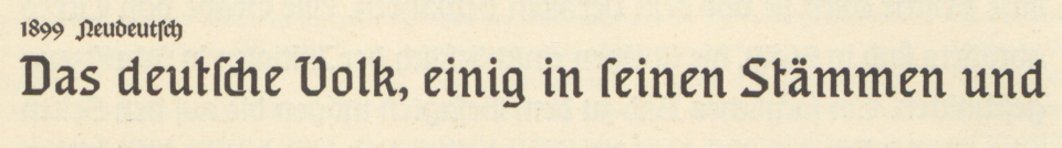
Neudeutsch: Designed at the Reichsdruckerei by Georg Schiller, who may have also cut the typeface’s punches. Produced in thirteen sizes (6 through 72 Didot points). Used for composing the text of the German Empire’s catalog for the 1900 World’s Fair at Paris. Steel punches for the 6 through 20-pt sizes are in the museum’s Bundesdruckerei cabinets today. There are also brass patrices (»Originale in Messing«) for the typeface’s 36-pt size, as well as for some of Neudeutsch’s 14, 16, 20, and 28-pt numerals. Although Crous does not mention any of the Reichsdruckerei matrices having been directly engraved, an examination of the Reichsdruckerei matrices at the Museum für Druckkunst Leipzig might show that some of these typefaces’ sizes were indeed produced by that means. That could be an explanation for certain sizes of the typefaces mentioned in this post not having any steel punches – or brass or lead Originalen – in the Bundesdruckerei cabinets.
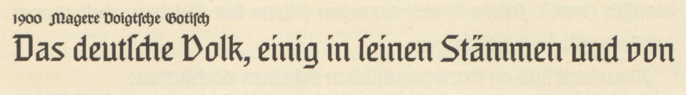
Magere Voigtsche Gotisch: Designed by Professor Paul Voigt, head of the Reichsdruckerei engraving department, who may have also cut the typeface’s punches. Produced in eleven sizes (5 through 32 Didot points). The Bundesdruckerei cabinets hold steel punches for the 5, 6, 8, 10, 12, and 14-pt sizes.
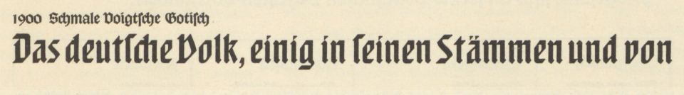
Schmale Voigtsche Gotisch: Designed by Professor Paul Voigt, head of the Reichsdruckerei engraving department, who may have also cut the typeface’s punches. Produced in fourteen sizes (6 through 60 Didot points). The Bundesdruckerei cabinets hold steel punches for the 5, 6, 8, 10, 12, 14, and 16-pt sizes. They also have patrices cut from lead blocks (»Originale in Blei«) for the 32, 40, and 54-pt sizes.
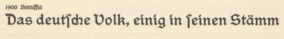
Borussia: Designed at the Reichsdruckerei by Georg Schiller, who may have also cut the typeface’s punches. Produced in eleven sizes (6 through 72 Didot points), the steel punches for the 6, 8, 10, 12, 16, 20, and 28-pt sizes are in the Bundesdruckerei cabinets today.
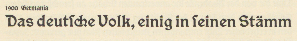
Germania: Designed at the Reichsdruckerei by Georg Schiller, who may have also cut the typeface’s punches. Produced in thirteen sizes (6 through 96 Didot points). Used for composing the text of the German Empire’s catalog for the 1904 World’s Fair at St. Louis. The steel punches for the 6, 8, 10, 12, 16, and 20-point sizes are in the Bundesdruckerei cabinets today.
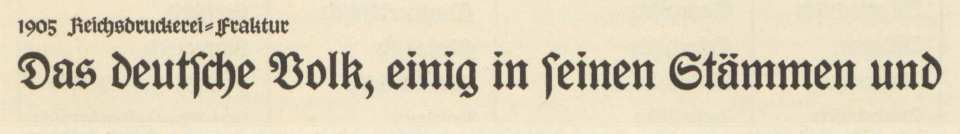
Reichsdruckerei-Fraktur: Designed at the Reichsdruckerei by Georg Schiller, who may have also cut the typeface’s punches. According to Schiller’s Probesätze der Druckschriften booklet, the typeface was produced in fourteen sizes, but since I have not found a Reichsdruckerei catalogue that includes these in it, I do not know what they are. For the family’s regular weight, the Bundesdruckerei cabinets have steel punches for the 5, 8, 9, 10, 12, 14, and 16-pt sizes, as well as engraved patrices for the 84-pt size. There are also steel punches for the family’s 5, 6, 8, 9, 10, 12, 14, and 16-pt heavy and condensed weights, respectively.
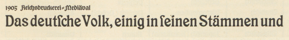
Reichsdruckerei-Mediäval: Designed at the Reichsdruckerei by Georg Schiller, who may have also cut the typeface’s punches. According to Schiller’s Probesätze der Druckschriften booklet, the typeface was produced in fourteen sizes, but since I have not found a Reichsdruckerei catalogue that includes these in it, I do not know what they are. For both the family’s normal and heavy weights, the Bundesdruckerei cabinets hold steel punches for the 5, 6, 8, 9, 10, 12, 14, and 16-pt sizes.
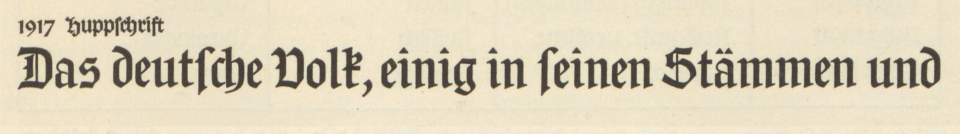
Huppschrift: Designed by Professor Otto Hupp. According to Crous, only the trial size of this typeface was cut in 1917. Although it was eventually produced in at least three sizes, that work took about another decade. I do not yet know how many total sizes of the Huppschrift were cast; in the autumn of 1915, ten sizes were being discussed – but I do not know what those would have been. The Bundesdruckerei cabinets have steel punches for the Huppschrift in 10, 12, and 16-pt sizes. Crous wrote that this design »… für sich selbst spricht und ihre Zeit überdauern [wird]« (“… speaks for itself and will last beyond its time”), which today reads like a bit of overdone marketing, as his prediction proved to be decidedly inaccurate.
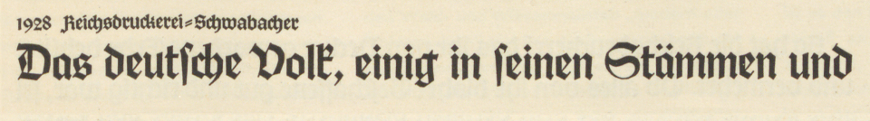
Reichsdruckerei-Schwabacher: Designed at the Reichsdruckerei. I do not know how many sizes it was produced in, but examining the Museum für Druckkunst Leipzig’s matrix collection could give the answer. Cast fonts of all sizes of the typeface could be at the Offizin Haag Drugulin in Dresden, too. The Bundesdruckerei cabinets have punches for the typeface’s regular and bold weights in sizes 5, 6, 8, and 10 pt each. The cabinets only have punches for the heavy weight’s 5 and 10-pt sizes.
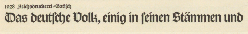
Reichsdruckerei-Gotisch: Designed at the Reichsdruckerei. I do not know how many sizes it was produced in. The museum’s Bundesdruckerei cabinets have steel punches for the typeface’s regular weight in 3, 5, 6, 8, and 10-pt sizes. There are also bold punches for the 8 and 10-pt sizes.
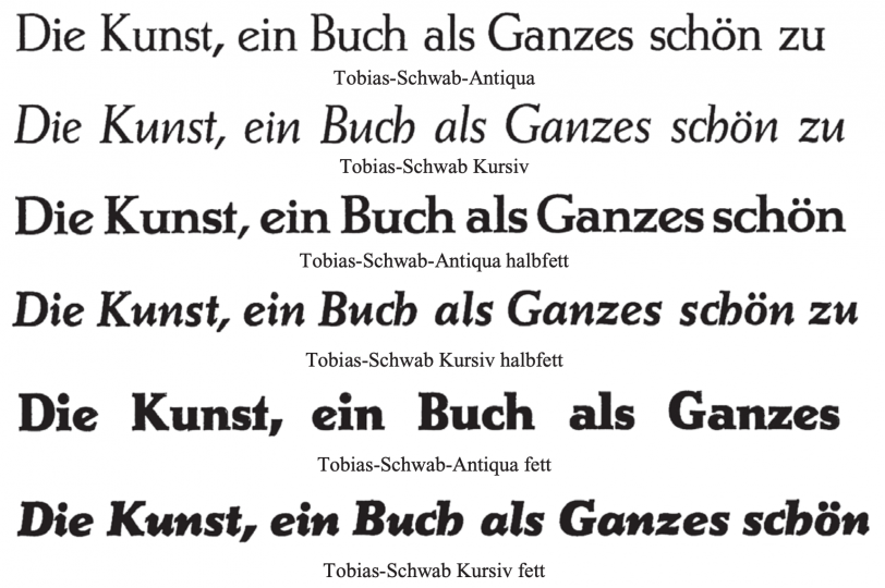
Above: A screenshot from Otmar Hoefer and Hans Reichardt’s PDF on Karl-Tobias Schwab’s typefaces.
Tobias-Schwab-Antiqua and Tobias-Schwab-Kursiv: Designed by Karl-Tobias Schwab and produced at the Reichsdruckerei. I do not know how many sizes were created. The museum’s Bundesdruckerei cabinets have steel punches for the roman’s 3, 5, 6, 8, 9, and 10-pt sizes, the bold roman’s 5, 6, 8, 9, and 12-pt sizes, the heavy roman’s 6, 8, 9, and 10-pt sizes, and the italic’s 3, 5, 6, 8, 9, and 10-pt sizes.
Punch storage in this smaller cabinet
When I published this series’s first instalment back in September, I uploaded several photographs of drawers from the larger Bundesdruckerei cabinet – held in the museum’s off-site storage depot – to Flickr. I added photos from the smaller cabinet to this group, too. Many of punches in the smaller cabinet’s drawers are stored in the same way, with each punch placed vertically inside a hole drilled into a thick wooden board. The bigger the point size of the punches, the larger the holes. However, not all the punches in this smaller cabinet were stored that way. Punches for a good number of Reichsdruckerei typefaces were stored wrapped in paper instead.
Stiftung Deutsches Technikmuseum Berlin, inventory number 1/2018/0342, drawer 24. Steel typographic punches for the twenty-six capital letters from the 16-pt size of the Reichsdruckerei’s Psalter Gotisch typeface, which had been stored wrapped in paper. Other punches from this typeface are still wrapped, in the background.
Depending on the point size – larger letters have larger punches – a typeface’s collection of punches might be wrapped inside of one paper bundle, or broken up into several individual bundles. Most of the punches for the various sizes of the Künstlerschriften described in this post are wrapped inside paper bundles, rather than placed freely into wooden holders.
Otto Hupp and the question “What’s the point?”
The Reichsdruckerei typefaces must have been produced at considerable expense to the printing house. Several of them do not seem to have been used very much. Some of the Reichsdruckerei typefaces were seemingly designed and cut as part of greater design schemes for World’s Fair catalogues. To me, one of the more curious typefaces in this collection is Otto Hupp’s Huppschrift. As part of the research for my dissertation, I visited the Bayerisches Hauptstaatsarchiv in Munich, where Otto Hupp’s considerable Nachlass is stored. His papers included a few drawings for the Huppschrift,[1 and 2] as well as draft letters to the Reichsdruckerei’s then-director, Heinrich Görte. Based Hupp’s draft letters, his work on the typeface began just before the outbreak of the First World War. In a draft letter to Privy Councilor Görte from 9 October 1914, Hupp mentions a drawing he had made for the typeface. Below, I have translated part of that draft letter, since in it Hupp explains a bit of his process, as well as the size he worked at (which was not the size Görte had requested):
As much as your desire for a typeface that is particularly suitable for reproducing older German seals is appealing and stimulating, the form that you would like to see the design carried out in is simply not ‘at hand.’ You requested a lettering sample in original size. This request is as important to me as any could be. But I find it very difficult to carry out. For there is nothing that I am less of than a calligrapher. And to draw a piece of text in its original size as cleanly and uniformly as it would be necessary to get a reasonably accurate idea of how it would appear in a final print is too difficult of a task for me. That’s why I made a sketch at twice the original size some time ago, which I intended to bring to Berlin personally during my visit to the Leipzig exhibition [note: presumably, this was the Bugra in summer 1914]. Then the Great War came and postponed my travel plans so thoroughly that my intended grand journey to Leipzig, Berlin, and the surrounding area melted into a short trip to the [Leipzig] exhibition.
In particular, I am intrigued by Hupp’s statement that he was not a calligrapher, since authors from Rudolf Koch to Paul Shaw have praised him for his being a calligrapher. Having looked through all surviving letterform items in his papers at the main Bavarian state archives, however, I can confirm that Hupp drew his letterform’s; he did not write them out with a broad own, even if his lettering and his typefaces look like they might have resulted from broad-pen writing.
In an 18 November 1915 draft letter to Görte, Hupp wrote about the necessity for different optical-size designs in typefaces. Indeed, statements like this abound in Hupp’s writing. One of those was repeated by Karl Klingspor in his 1949 book, Über Schönheit von Schrift und Druck. That, in turn, was cited by Tim Ahrens and Shoko Mugikura in their 2014 book, Size-specific Adjustments to Type Designs. Hupp’s 1915 formulation of this concept reads:
I am happy to accommodate your wish to expand the typeface to not only cover the three most-common sizes but also the entire ten-size range. However, this requires a considerable amount of additional work. I can assume that you will not order simple mechanical enlargements and reductions. With a typeface, it is not any different than in architecture: when mechanically enlarged, a quaint atmospheric chapel will not result in an impressive cathedral any more than a cathedral, when reduced to a tenth of its size, will yield a pretty chapel. Likewise, a typeface does not have to change from one size to the next. But at intervals of about every three or four sizes, its design must be simplified or enriched.
Presumably based on drawings Hupp provided, the Reichsdruckerei’s engraving staff produced a trial size of the Huppschrift in 1917. I am not sure what type size this trial took, but there are two possibilities I can think of based solely on the materials for the typeface in the Bundesdruckerei cabinets. For instance, in drawer number 86 – the same drawer that has all the cabinets’ Huppschrift punches – there is a paper-wrapped package labelled »Schriftprobe H. 2273 Korpus Huppschrift«. That drawer already has a package of 89 punches for the Huppschrift’s »Korpus«, or 10-pt size. Unfortunately, on the day that I photographed all the small cabinet’s drawers, I did not notice this discrepancy and open the two packages to see what was in each one.
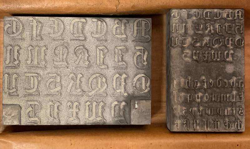
10 pt strikes me as an odd choice for making a design’s trial cut (or pilot size). In German foundries at the time, something closer to 28 pt was a more common choice for a typeface’s pilot size. Hupp’s Nachlass has a trial print of the typeface’s 16-pt size;[3] perhaps this could have been the pilot.
The Bundesdruckerei cabinets’ drawer number 104 has two plates that might include the Reichsdruckerei’s 1917 trial letterforms for the Huppschrift. Hupp’s Nachlass has prints of these, too.[4] Each of the plates has a thickness that is probably type-height, but I have not been able to check. The wider of the plates, which you can see above on the left, has was a probably large-size decorative capitals for the Huppschrift; indeed, Hupp’s Nachlass in Munich contains drawings for a few of these Huppschrift letters with the thin horizontal “out-stroke” running below the rest of the letterform. The right-hand plate has smaller-sized uppercase and lowercase letters. Since the letters on these plates are not raised very high off of the background, I doubt that these plates were created as the master patrices for matrix-electrotyping. Instead, I think that these plates are probably clichés made to print the Huppschrift letterforms for photographing. The photograph could then be resized to test the typeface’s appearance out at various sizes. Perhaps the 1917 trial of the Huppschrift was not type at all, or maybe these plates were simply part of the trial-cutting process.
As I mentioned above, it took some time between when the pilot and the final number of Huppschrift sizes were actually cut, struck, and cast. The Huppschrift was not used in any Reichsdruckerei printing until 1928; this was a publication about the Reichsdruckerei itself entitled Die Reichsdruckerei in Berlin: Eine kurze Darstellung ihres Werdens und Wirkens.
Between about 1881 and 1903, Otto Hupp collaborated with Emil Julius Genzsch’s typefoundries – Genzsch & Heyse in Hamburg and E.J. Genzsch in Munich – on the design of several fonts of initials, ornaments, and eventually alphabetic typefaces like is 1899/1900 Neudeutsch, which was a completely independent design unrelated to the Neudeutsch designed by Georg Schiller and produced at the Reichsdruckerei, shown above. By 1904, Hupp had switched his representation to the Rudhard typefoundry in Offenbach am Main. This was owned by Karl and Wilhelm Klingspor, who renamed their firm Gebr. Klingspor in 1906. Why did Hupp, after switching from Genzsch’s firms to the Klingspors’, decide to collaborate with the Reichsdruckerei on a typeface a decade later? Since he was still proposing new typeface concepts to Karl Klingspor as late as 1921 – and Gebr. Klingspor published the Hupp-Schrägschrift in 1922 – I do not believe that there was any break in his relationship with that firm. Perhaps Hupp’s Reichsdruckerei collaboration had to do with the wartime economy. While large typefoundries like H. Berthold AG in Berlin or the Bauer’sche Gießerei and D. Stempel AG in Frankfurt am Main were able to switch their efforts toward weapons-production for the war effort after August 1914, and through this to prosper enough economically to even grow, Gebr. Klingspor shrunk after the war’s outbreak (according to Hans Halbey, the foundry had two hundred forty workers in 1914, but in 1915 it only employed fifty-seven).
The war may have also caused economic hardship for Hupp, causing other clients to have to stop sending him commissions; perhaps the Reichsdruckerei project was much-needed government help. Hupp had already prepared a twice-actual-size drawing for the Huppschrift’s trial size before the summer of 1914, but in Hupp’s 18 November 1915 draft letter – cited above – he mentioned that the Reichsdruckerei had increased the scope of the typeface from the original total of three sizes to ten. The reason for this increase in scope could have simply been that the Reichsdruckerei had decided that a broader size range could be more useful. Or, they could have increased the project’s size to keep Hupp busy.
Paul Helmut Rädisch
Around the time the pilot size for the Huppschrift was cut, Paul Helmut Rädisch was working in the Reichsdruckerei’s engraving department. As punchcutters go, Rädisch is one of the most well-known craftsmen to have worked during the twentieth century, thanks to his having cut the punches for Jan van Krimpen’s foundry typefaces at the Joh. Enschedé en Zonen printing house in Haarlem. Rädisch and Van Krimpen’s collaboration at Enschedé has been described by several authors, including John Dreyfus, John Lane, Gerrit Willem Ovink, and Walter Tracy. Rädisch’s process has also been described by type designers, including Carl Dair and Matthew Carter.
After apprenticing as a punchcutter at the Leipzig punchcuttery of Paul Schwieger between 1905 and 1909, Rädisch eventually found his way to Haarlem, where he gained employment at Enschedé in 1910. He was called into the German army when the First World War broke out in 1914, and at some point early in the conflict, he was injured in France. This got him out of military service and he went to Berlin. According to Rädisch’s Dutch-language autobiography – and Ovink’s English-language review of the book – Haarlem connections got him a job at the Reichsdruckerei.
From 1874 until 1886, the punchcutter Gottlieb Schlegelmilch – then a young man – had been one in a series of German punchcutters working at Enschedé. Germany in the industrial-typefounding period had at least one hundred people working in punchcutting and must have had far more punchcutting training programs in place than the Netherlands. I don’t know when Schlegelmilch began working at the Reichsdruckerei, but Ovink’s article suggests that he had been there since at least 1900 and that he retired after the end of World War I.
Ovink and Rädisch provide precious details about the Reichsdruckerei engraving department during the war. At this time, the department was still headed by Prof. Paul Voigt (who had designed – and presumably also cut – the Voigt-Gotisch typefaces there around 1900). Twenty-six people worked in the department, which I assume included Rädisch, Schlegelmilch, and Voigt. By Ovink and Rädisch’s descriptions, Rädisch seems to have primarily engraved postage stamps while at the Reichsdruckerei, but I do not find it inconceivable that he or Schlegelmilch or Voigt could have cut some or all of the Huppschrift’s pilot size (and/or final sizes). In any event, it would have been cut by someone in the engraving department, or by some constellation of the department’s workers.
Inside the issue of Archiv für Buchgewerbe und Gebrauchsgraphik that the Reichsdruckerei’s cited supplement appeared in, the journal’s editors ran the following notice:
Im übrigen aber … [übertrug man die Schriften] technisch und künstlerisch vorgebildeten Stempelschneidern und pflegt besonders den manuellen Stempelschnitt, der von der Bohrmaschine immer mehr zurückgedrängt wird.
Incidentally, … [the Reichsdruckerei typefaces were transferred to] technically and artistically trained punchcutters and manual punchcutting – which is increasingly being repressed by the pantograph machines – is being particularly maintained.
According to Ovink, “there was only one pantograph [in the Reichsdruckerei engraving department], and that was for [cutting the masters for] printing types larger than 12-pt. in lead,” as Crous had written in 1929. The Reichsdruckerei’s typefoundry was not the only type-making facility in late-imperial and Weimar-era Germany that worked this way as its standard practice. Julius Rodenberg wrote that, in the same year, the Gebr. Klingspor foundry at Offenbach had seventeen punchcutters but only two matrix engravers on staff. Beginning at least in the mid 1920s, Rädisch would only hand-cut typographic punches in steel at Enschedé, instead of engraving punches and/or matrices with a pantograph. This was Rädisch’s documented practice for at least three decades (i.e., up until his retirement during the mid 1950s).
By the 1880s, at least some American typefoundries had adopted pantograph engraving, instead of hand-cutting punches in steel at actual size, as had been standard practice in typefounding for centuries up until that point. While some German typefoundries began adopting mechanical engraving in the 1890s, and very large firms like Berthold and Stempel had started using pantographs by 1910, at least some smaller foundries like Gebr. Klingspor – or the in-house unit at the Reichsdruckerei – were still making many of the master forms for new typefaces by very traditional methods a few decades after that.
Further research
The Bundesdruckerei cabinets at the Stiftung Deutsches Technikmuseum Berlin are invaluable sources for research into industrial-era typefounding history. In this post and the previous one in the series, I have explained how it contains type-making artefacts from punchcutters like Ferdinand Theinhardt. It has punches cut according to designs from Joseph Sattler, Georg Schiller, and Otto Hupp – among other designers active during the twentieth century in the German book trades. Some of the punches from Decker foundry must date back to the early nineteenth century, at least. If this collection and the related collection of matrices at the Museum für Druckkunst Leipzig would be examined together, we could gain a deeper understanding of how type at one of Germany’s largest and most prestigious industrial-era printing houses was made.
Notes
If you are in Munich and you want to have a look at these specific items, here are some inventory numbers to use:
- Bayerisches Hauptstaatsarchiv, Nachlass Hupp 2.1.1.1, folder 105, sheet 1 has drawings for letters that are probably the Huppschrift.
- Bayerisches Hauptstaatsarchiv, Nachlass Hupp 2.1.1.1, folder 105, sheet 23 has drawings for the more decorative/larger Huppschrift capitals.
- Bayerisches Hauptstaatsarchiv, Nachlass Hupp 2.1.1.1, folder 106 has a small sheet in it with the title »Tertia Huppschrift (H.1351)«. This has ten lines of text in the Tertia size (16 pt) of the Huppschrift. Underneath that is a character set showing that runs for three lines.
- Bayerisches Hauptstaatsarchiv, Nachlass Hupp 2.1.1.1, folder 107, sheet 4 is a test print of the trial Huppschrift plates pictured above.