I’ve had a copy of Slanted magazine’s newest issue on my desk for weeks. The pals over at MAGMA Brand Design were very kind to send me a copy, and I enjoyed flipping through the issue very much. Still, I have no idea what to write about it.
Issue 15’s theme is “Experimental,” which surprises me somewhat. The previous two issues were dedicated to humanist and grotesk-style sans serif typefaces (geometric sans serifs were tackled all the way back in issue 7), and issue 16 promises to be about extremes in type design – the advertised theme is “Bold/Light.” Still, Slanted isn’t a magazine like Typography Papers. It isn’t PAGE, novum, HOW, eye, or baseline either. Slanted is just weird. And by weird, I mean mind-blowingly-awesome, with its finger on the pulse of the now. Its designers at MAGMA Brand Design are some of Germany’s best. Whenever I teach a class, one of the first questions I ask my students is to name their favourite typeface. I held a workshop earlier this year where about a quarter of the students all named typefaces that were featured in Slanted 11: Monospace. Typewriter. If you are on the forefront of typography here, you care about Slanted magazine.
Still, an issue titled “Experimental” just doesn’t feel right. Everything that Slanted publishes is new; a lot of its contents are short-lived student projects. These are always experimental works. Slanted’s layout is a continuing work in progress; articles are often presented in untraditional ways. The entire magazine has been an ongoing experiment, and will hopefully remain so. To single out a crop of work from the past few months or years for this issue – and to label this “experimental” work – seems to run against the grain.
This does not mean, dear readers, that I recommend against purchasing Slanted 15. Most of you are probably long-familiar with Slanted, and will read the issue no matter what I might write here. But, if you are not a Slanted purchaser/reader/subscriber yet, I recommend joining the crowd. Slanted supports design today, and the project itself should be encouraged and supported.
So, what did I particularly enjoy about issue 15? To start off, the cover design comes in lots of different colors. My copy has a cool green-and-orange split fountain printing-thing going on. The black and white photos of Lara Henning and Manuel Wesely’s design for the HBK Saar 2011 Diplom exhibition are pretty awesome. Slanted always has a copy of great interviews in each issue. The interviewees are often speakers from the annual Typo Berlin conferences. Shelley Gruendler has an interesting article in this issue called “Just Try.”
There are a copy of different paper stocks used in the issue, and I really like the typeface used for the text this time. It is called Korpus, from Michael Mischler and Nik Thoenen at Binnenland. The caps remind me a little bit of Malabar’s, which is probably why I like it so much. Of course, it would be awesome if Slanted would use Malabar in an issue; but she would never, ever work on the kind of paper stock they usually print on.
Here is some more information about Slanted 15, directly from MAGMA Brand Design:
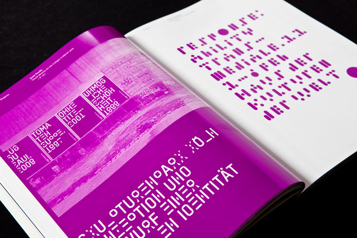
Slanted #15 – Experimental deals with experimental design strategies in typography and graphic design. This issue presents projects incorporating the accident into the design process, works based on mistakes and inaccuracy, fonts that derive from a concept or a system – in the end work that experiments or goes unconventional ways in design.
The playful handling of tools, forms and concept is a popular procedure to broaden the consciousness in typography. It seems to be (regarding the huge amount of entries for this issue) a widespread phenomenon, very popular at design schools and universities. This is not a surprising fact – especially in interaction with a model, experimental results are the foundation of a theory. We placed a special experimental type section with 48 pages in this issue to be able to present a large collection of typographical experiments.
Inaccuracies sometimes lead to new precision – as in this issue’s text font. The typeface Korpus has been designed by Michael Mischler and Nik Thoenen of Swiss fontlabel Binnenland. It is based on a careful analysis of inaccuracy occuring in the print image of early 20th century fonts.
This issue’s cover is realized in an old-fashioned, experimental procedure, too: its print sheet has been produced in rainbow printing using HKS colors.
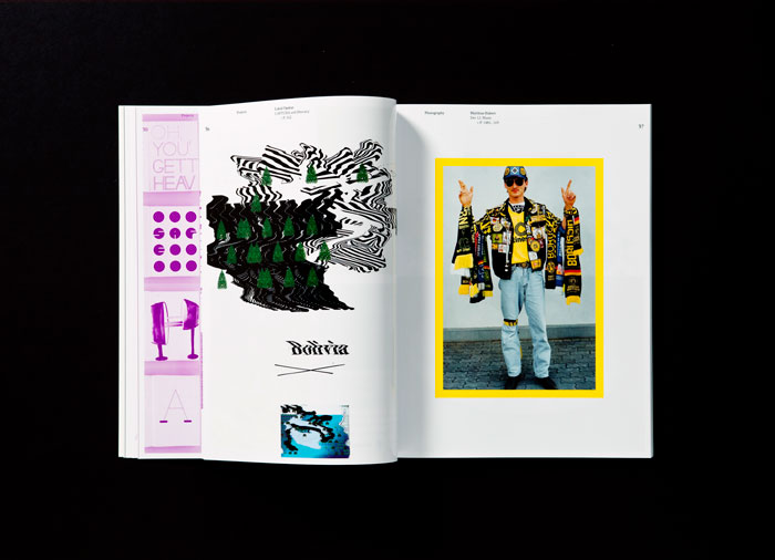
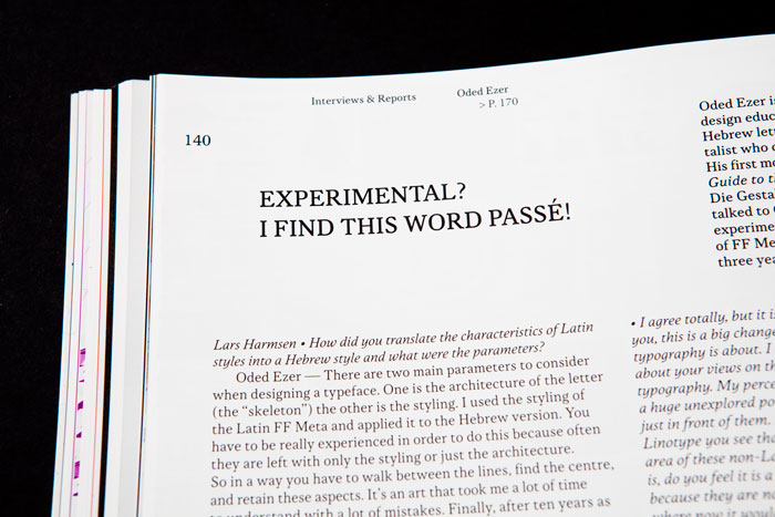
We are proud to present the photo series of Matthias Hubert (Dortmund), who photographed fans of the current German soccer champion, and of Ken Rosenthal (Tucson, AZ), who opens the darkroom to the experiment. The type essays of Christine Hartmann (Leipzig), Will Hill (Cambridge) and Shelley Gruendler (Galiano Island) deal with strategies of the experiment in typography. Read interviews with Peter Bi?ak (The Hague), Michael Mischler and Nik Thoenen (Berne), Martin and Thomas Poschauko (Au near Bad Aibling), Oded Ezer (Givatayim), Donald Beekman and Liza Enebis (Amsterdam) and Neville Brody (London) as well as an essay about Japanese Modernism, the fifth part of the Tokyo Report, both by Ian Lynam (Tokyo), and the next sonic travelogue by Frank Wiedemann (Berlin).
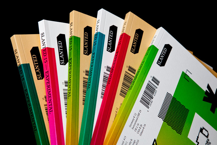
Slanted Magazine #15
Experimental
Autumn 2011
180 pages