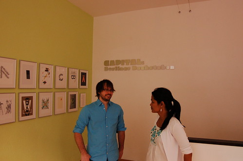
Last night, the Mota Italic Gallery opened for business. Billed as a “type foundry, gallery, and boutique,” the Mota Italic space in Berlin’s Prenzaluer Berg neighborhood represents a new chapter in the company history. Founded in October 2009 by Rob and Sonja Keller, Mota Italic is dedicated to offering complex typographic solutions to clients worldwide. On a local level, Mota Italic now offers a venue for typographic exchange.
The Mota Italic Gallery’s premiere exhibition, Capital: Berliner Buchstaben, will run through July 22, 2011. For the inaugural show, Rob and Sonja invited 27 Berlin-based illustrators to create pieces of lettering dedicated to single glyphs from typefaces by 27 Berlin-based type designers. Why the number 27? Aside from the 26 letters of the alphabet, Mota Italic included the ß, a favorite German diacritic.
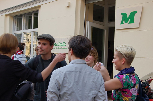
Many factors contributed the high attendance at this opening. First, it took place on the evening before the start of TYPO-Berlin 2011. Many conference attendees were already in Berlin, and were looking to jumpstart their typographic fulfillment. Additionally, the resident Berlin Type community is even more active that usual during the week of the annual TYPO-Berlin. Finally, the exhibition did feature the work of 54 designers … not a small number of participants. While I did not keep a head count, there were consistently more attendees throughout the evening than could fit inside the 35m² gallery space. The crowd spilled out onto the Schliemannstraße sidewalk. There were more attendees crowded in the space outside the gallery than inside of it.
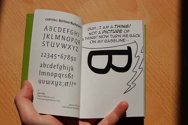
MPF Ode by Martin Wenzel, illustrated by Kaune & Hardwig.
Mota Italic published a catalog for the exhibition. Although the €10 price for a four-color, DIN A6, 90-page book may seem steep, it is worth the cost. Indeed, this catalog is a snapshot of contemporary Berlin type history itself. Aside from the images shown in the exhibition and the typefaces from which the letters came, the book features a 10-page essay—including the English and German versions—about the current Berlin design scene, written by Jan Middendorp. The catalog is typeset in Rob’s Vesper typeface, as well as Pufff … a counterformless display face created exclusively for the exhibition.
Exhibited Type Designers
Alessio Leonardi, Andrea Tinnes, Anton Koovit, Bernd Möllenstädt, Dan Reynolds, Elena Albertoni, Erik Spiekermann, Fritz Gröle, Georg Seifert, Gesine Todt, Hannes von Döhren, Jan Fromm, Jens Kutilek, Julia Sysmäläinen, Jürgen Huber, Luc(as) de Groot, Ludwig Übele, Martin Wenzel, Melle Diete, Ole Schäfer, Ralph du Carrois, Rob Keller, Roman Wilhelm, Sveinn Davíðsson, Ulrike Wilhelm, Verena Gerlach, and Viktor Nübel.
Exhibited Illustrators
alvvino, Apfel Zet, Auge Lorenz, Charlotte Driessen, Christine Gertsch, Christopher Breu, Claudia Silbermann, Cristóbal Schmal, Delia Keller, Dennis Michaelis, Emilia Forstreuter, Felix Bork, Ferdinand Ulrich, HORT, Kaune & Hardwig, Kerstin Hille, Klaus Rähm, Laura Dreßler, Laura Serra, Mark Frömberg, Nadine Roßa, Raban Ruddigkeit, Siggi Eggertsson, Slawek Michalt, Sonja Keller, Stepan Ueding, and Stephan Müller.
Address
Mota Italic
Schliemannstraße 34
10437 Berlin
Opening Hours
10:00-18:00, Tuesday–Saturday. More photos from the exhibition opening may be viewed on flickr here.