In August, the people behind Slanted published the first issue of a new magazine called Cheers. It offers in interesting combination of photography and letterforms. This issue, containing text in both German and English, was printed in an edition of 2000. The magazine’s colophon describes the thinking behind its design philosophy well:
Cheers magazine is a publication for photographers and font-designers who are interested in presenting new works. In cooperation with Slanted and Volcano Type, Cheers is also a networking project to show new fonts in use. The printing of Cheers magazine is financed by the presented photographers. The first Cheers magazine will be distributed for free to design studios worldwide that hold a subscription to Slanted magazine.
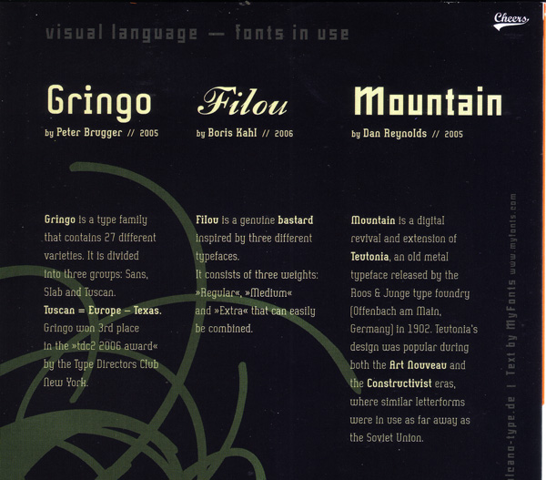
In this inaugural issue, the following typefaces from the Volcano Type foundry were used: Filou, Gringo, and Mountain, designed by Peter Brugger, Boris Kahl, and myself, respectively. Additionally, SteroType’s Marcelle appears in the design. Until recently, I had not seen Cheers. Jürgen Siebert had a copy, which Frank Grießhammer won in a FontBlog raffle, together with the 11th Slanted issue. Frank was kind enough to give his copy to me last week, and I am pleased to share a few images of the type here (especially Mountain).
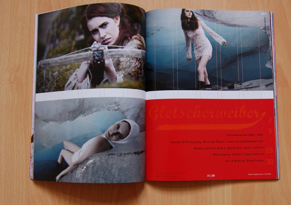
A spread introduction one of the two photographers featured in the issue.
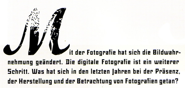
Above, the M is from Marcelle, a free font. The remaining text in the image is set in Mountain Regular.
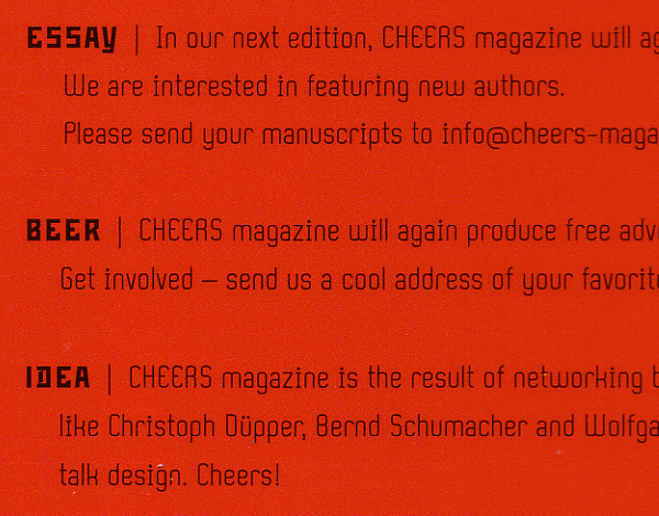
Close-up of Mountain Italic.
The body text throughout the magazine is set in Peter Brugger’s Gringo.
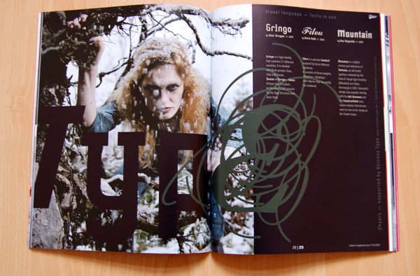
Integration of text and image.
For a design magazine—heck, for any sort of magazine—a lot of respect and space are provided for the typefaces used.
Cheers magazine is the most thorough example of Mountain in use that I have ever seen. Mountain is not the main typeface of the magazine, but it is used a lot. Both Mountain, and Mountain Italic appear (but not their small caps). The fonts are used in sizes 7pt, 9pt, 11pt, 14pt, 32pt, 36pt, and 38pt. How do I know the exact point sizes? There are font credits on the bottom of each page.
More information about Mountain’s design may be read in an older TypeOff. post. Here are a few other samples of Mountain in use: the Bastard Project and Prosanova. The Mountain family has a page at Volcano Type’s website, and the fonts may be licensed via Linotype.com or MyFonts.com
The first issue of Cheers magazine may be ordered at Slanted.de