
Paul Stiff, “Material texts: typography and reading in everyday life.” The first presentation to take place at the ATypI Dublin 2010 on Friday, September 10th. Photo by Nina Stössinger.
Almost a week has past since this year’s ATypI Dublin 2010 conference ended. The Association Typographique Internationale, founded in 1957, travels annually to meet in a different city. Right off the bat, I’ll state that – out of the six that I have attended – the 2010 event in Dublin was the best. Over the past week, I have scribbled down a lot of notes about what happened, things that I saw, and words that were said. Unfortunately, I took very few photographs. I will try to edit, compile, and break these notes down over the next several weeks, posting them here in reasonably sized articles.
I’m not sure what my exact timeframe will be. On Tuesday, I’ll be flying to Italy for a two-week vacation. This will be my first longer-than-four-day vacation in over four years. I am really looking forward to it, and have decided not to be online during that time. Also, after I return to Berlin, I think that I will be getting a dog. This will probably slow down my further publishing plans somewhat.
Waiting is the hardest part
I had been anticipating this event ever since I first had the pleasure of meeting its two principal organizers – Clare Bell and Mary Ann Bolger – at the 2005 ATypI conference in Helsinki.[1] They mentioned that they hoped to someday host an ATypI conference in Dublin. I had never been to Ireland, and though that this would be a great introduction to the country.
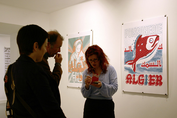
Clare Bell is standing on the left in the photo above; Mary Ann Bolger is on the right. From the opening of Verena Gerlach’s Paradox Alg(i)er(s) exhibition in The Factory Space, on the night before the ATypI PreFace sessions began. Photo by Florian Hardwig.
Type design and typography seem to be small communities. The sort of people that regularly attend ATypI conferences form an even smaller number. Over the years, at other ATypI conferences, I would see Clare and Mary Ann again. They seemed determined to bring the ATypI to Ireland. As for myself, I was determined to attend that conference, should it ever take place. I had begun wracking my head about topics that I could potentially speak about there. In Helsinki, I had shown them an uncial design that I was working on.[2] Since they often seemed to recall this design, I focused my thoughts onto paper possibilities for some aspect of uncial type.
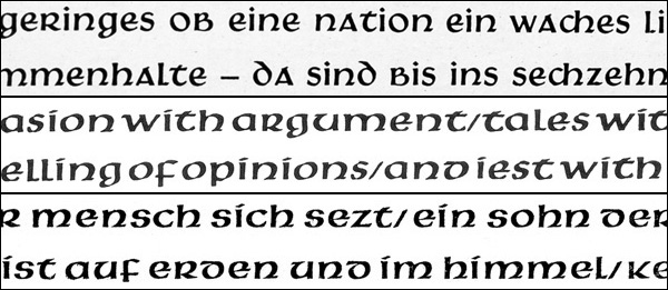
A comparison of text set in Victor Hammer’s Hammerschrift, Samson, and Pindar typefaces. Only Pindar included a full-range of capitals, so no uppercase letters are included in this sample.
Before 2010, I had never proposed a paper for the ATypI conference, although I had spoken at other events. When I read the call for papers notice early this year, I brooded about for days; it was put-up-or-shut-up time. My favorite typographic topic is the history of the Gebr. Klingspor Foundry in Offenbach, so I sent in a proposal for a talk on Victor Hammer’s relationship with the company.[3] I am very grateful that this paper was accepted. Now that the conference is long past, you can read that paper and see all of its illustrations here: Victor Hammer and Gebr. Klingspor.
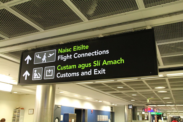
At Dublin airport, all signage is bi-lingual: Gaelic – or Irish – and English. Both languages are set in the same point size, in the same sans serif typeface. Were designers having a bit of fun by setting the Irish text in Green? Photo by Kunihiko Okano (Shotype).
My first day in Dublin
I flew into Dublin from Berlin, via Amsterdam, on Tuesday, September 7. Of the many Berliners at the conference, I seem to be the only attendee who did not fly to Ireland directly, which in retrospect was quite a mistake. On both legs of my journey, my luggage was unable to make its connection at Schiphol airport.[4] At Dublin airport, I met several ATypI members at the baggage claim. I shared a taxi into the city with Monika Bartles and Dave Crossland. Dave had booked accommodation in the dorms on the Trinity College campus, which seems to have been an inexpensive opportunity that many conference attendees took advantage of. I had made a reservation at the Trinity Capital hotel, between the college and the river.
A little after 6pm, I met up with Indra Kupferschmid and Eben Sorkin. Together, we walked to The Factory Space, to see Verena Gerlach’s Paradox Alg(i)er(s) exhibition. Verena lives less than a block away from me in Berlin, and I have already purchased one of the posters[5] that she was exhibiting. Nevertheless, I had not seen her work hanging yet. The event was a great beginning to the conference. There was free wine and finger food, as many guests as could fit into the underground gallery, and short speeches from John D. Berry, the president of the ATypI, Verena herself, as well as a representative from the Goethe Institute in Dublin.
Verena’s exhibition was a great place to finally meet some designers from Ireland, too. Every ATypI conference is a great opportunity to see a mix of same familiar faces, as well as the new guests from the host city and country. Quite a few representatives of both these groups headed to a pub together for drinks, after the exhibition opening had ended.
Akira Kobayashi, Linotype’s Type Director, in a wicked-cool picture. Photo by Kunihiko Okano (Shotype).
Linotype, a Monotype Imaging Company
Looking back on back a few recent type events, I suppose that I have not waved my Linotype flag very often. This is a bit odd, as I am really quite a flag-waver. I have all sorts of flags; I can be quite vocal about my tribal feelings for the history of design in Offenbach, for type today in Berlin, for the MATD course at the University of Reading,[6] and even for type design as-a-thing. But I have a Linotype flag, too, even if it is not as wind-torn as my others; this article is as good a place to wave it as any.
I joined seven other Linotype employees at this year’s ATypI conference. On top of this, four of our Monotype Imaging colleagues were at the conference as well. How many other companies sent a similar amount of employees? Linotype and Monotype were quite a fixture of the program: Akira Kobayashi gave a daylong type design workshop during the PreFace. I spoke during both the PreFace and the main conference, and Nadine Chahine also was a conference speaker. Vladimir Levantovsky and Steve Lee each presented on web fonts at the PreFace. My other colleagues from Linotype and Monotype in attendance included: Atilla Korap, Robin Nicolas, Rebecca Schalber, Lorenz Schirmer, Jörg Schweinsberg, Dan Rhatigan, and Frank Wildenberg. Both Linotype GmbH and Monotype Imaging were Bronze-level sponsors of the event, and a Linotype Fonts in Focus brochure was one of the many events to be found in the conference goodie bag. I am really proud of the effect that we had on this year’s conference-goer experience. I will elaborate a bit more about this over my next few posts.
Great things that other bloggers have written about the conference
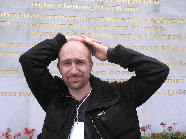
FontFeed-author Yves Peters, in front of some beautifully gilded Irish letters. Photo by Nina Stössinger.
There is still quite a bit that I hope to recount about the conference, including the PreFace, and details on a slew of great presentations. Other bloggers are faster, less angst-ridden, and more prolific photographers than I am. I find their writing quite interesting, and I read each of the following pieces more or less at the moment they were published. I find it helpful to round them up, and I hope that you enjoy reading these as much as I did.
Florian Hardwig’s announcement about the ATypI 2010 conference in Dublin at MyFonts.de (in German)Florian Hardwig’s report on arriving in Dublin and attending the Paradox Alg(i)er(s) exhibition at MyFonts.de (in German)Florian Hardwig’s report on the PreFace events at MyFonts.de (in German)Florian Hardwig’s explanation of the items in the conference goodie bag at MyFonts.de (in German)Florian Hardwig’s report on the first day of the main conference at MyFonts.de (in German)Yves Peters announcement of the Paradox Alg(i)er(s) exhibition on the FontFeedYves Peters looks back at ATypI 2010 Dublin: The Word on the FontFeed- Nina Stössinger set up an ATypI 2010 Group on Flickr; so far, it already has over 550 images
- I have two more posts about the conference: here and here
Three of the best German type bloggers, all in one picture; if only FontBlog-author Jürgen Siebert could have been in Dublin, too. From left to right: Florian Hardwig (MyFonts.de), Ivo Gabrowitsch (FontWerk.com), and Indra Kupferschmid (Kupferschrift.de). Photo by Nina Stössinger.
Footnotes
- During the 2005 ATypI conference in Helsinki, Linotype erected the “Linotype Lounge” next to the book-selling area. This lounge was something of a chill-out zone, with a number of chairs purchased from IKEA. We projected demos of the (then-new) Linotype FontExplorer X application on the wall. Somehow, during one of these demos, I got into a chat with Clare and Mary Ann about uncial typefaces. In my memory, this conversation runs together into another talk I had, with Oded Ezer, about authenticity in letterforms. I asked Clare, and Mary Ann, and Oded how far back a designer needed to go to arrive at a truly “authentic” Hebrew or Irish letter: a style uncorrupted by negative external influences. I think that these questions I had come about while I was showing Claire and Mary Anne the different uncial fonts in the Linotype library; I also showed them an uncial type I was working on at the time.
- This typeface was just one of those things that you do when you are young. I will never finish it, or distribute it. I think that its design is hopelessly awful.
- Gebr. Klingspor published two of Victor Hammer’s typefaces: Hammerschrift (1925) and Neue Hammer-Unziale (1954). They also produced a trial cast of Pindar (1935), and Rudolf Koch’s son Paul cut the punches for Samson (c. 1931).
- Aer Lingus delivered the bag to my hotel later on in the evening of my first night in Dublin, but KLM was not able to get my bag to Tegel airport until the day after I returned to Berlin; the Tegel airport staff brought my luggage to my apartment two days after I had returned home.
- The one with the big red fish; you can see the design hanging behind Mary Ann Bolger in the photo above.
- Speaking of tribal groups, the MATD twitter stream reported on the last day of the conference that 23+ MATD graduates attended this year’s ATypI. I will write more about my fellow alumni in my next posts.