Photo: Yvonne Schüttler.
During the next two months, I’ll be presenting at several events. Here’s a run-down:
19th Berlin Typostammtisch
May 6, 2010
Pecha Kucha night, “ten things I hate about typography class”
For the Berlin Typostammtisch’s second annual Pecha Kucha night, up to 12 of the city’s typorati will present on short topics for exactly 6 minutes and 40 seconds each. In this time, the Typostammtisch computer will shuffle through 20 slides, each of which will be presented for just 20 seconds. My topic (in German) relates to some of the evils many typography instructors inflict upon their students. See you there!
I’m not sure if all 12 of the evening’s slots have been filled yet. I guess anyone who still might be interested can drop Ivo a line
TYPO Berlin 2010
Haus der Kulturen der Welt | May 20–22, 2010
Handgloves or adhesion
Reading or writing, KABK Den Haag or University of Reading? It is often said about the two renowned typedesign masters degree programs (and their graduates) that they are rivals. There can be passionate discussions about the best method to draw an S. But is it true that both schools don’t like each other? Must it really be a question of faith which side one takes? What are the characteristics of the programs and in what ways do they differ? Those, and all your other questions, will be answered by two graduates from each school: Veronika Burian, Christoph Dunst, Laura Meseguer and Dan Reynolds.
Die Leidenschaft des jungen Multi-Script-Schriftgestalters
[German, with simultaneous English translation] In der neusten Generation arbeiten viele junge Schriftgestalter mit mehreren »Scripts« (oder Schreibsystemen). Sie wählen diese Art von Arbeit wegen der Herausforderung: Designer zeichnen Schriften, weil sie von Lettern getrieben sind. Nach näherer Betrachtung wirken Elemente anderer Scripts weniger fremd. Man lernt, mit anderen Regeln, Bräuchen und Geschichten umzugehen, was die Möglichkeit bietet, das Wesen der Typografie besser zu verstehen. Ob man das neue Wissen fürchtet, in Frage stellt, oder respektiert, ist gleichgültig. Die Tiefe der Welt der nicht-lateinischen Schriften wirkt wie ein Spiegel für die Leidenschaft des Designers. Ob man z. B. lateinische, kyrillische oder Devanagari Buchstaben zeichnet, ist unwichtig: Schrift leben lassen, darum geht es.
Fourth International Conference on Typography and Visual Communication
University of Nicosia, Cyprus | June 18, 2010
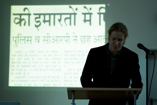
Some of India’s most-read newspapers and their typefaces
This presentation is concerned with the typography of Hindi newspapers, relevant both to India’s English-language dailies, as well as to each other. Spoken by over 400 million individuals, Hindi is India’s most widely used language. India has a vibrant newspaper landscape, and Hindi-language publications are the dominant player in the marketplace. In a competitive field, design can help lift a newspaper above the fray. A determining factor in the way Indian newspapers’ appearances are the tools used to set them, yet contemporary Hindi newspaper layouts draw from a pool of relatively few typefaces.
Illustrating this state of affairs, Dan Reynolds will discuss his analysis of the typographic situation, as well as the challenges and opportunities involved in developing new typefaces for Indic scripts in general, and Hindi newspaper design in particular.
Type Talks
House of the Lords of Kunštát, Brno, Czech Republic | June 21, 2010
The passion of the young, multi-script type designer
Many young type designers work with multiple scripts. They choose this kind of work for its challenges; designers draw type because letters drive them. After close inspection, elements of other writing systems seem not so different from our own. Learning other sets of rules, customs and histories lead to more opportunities to better understand the essence of type. No matter if one fears the results, questions, or respects them, the multitude of non-Latin scripts acts as a mirror for the depth of a type designer’s passion for letters. Whether one draws Latin, Cyrillic, or Devanagari letters is unimportant; making type happen is the key.
Yes, this is practically the same talk that I will be giving at TYPO Berlin, but in English instead of German.