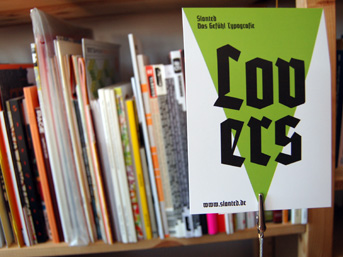
The newest issue of the Slanted magazine—its tenth—is entitled “Heavy Metal. Lovers.” Devoted to blackletter type, it is naturally a collection the absolute coolest elements in typography today. My love affair with blackletter runs deep; I’ve drawn half a dozen blackletter typefaces, but they never seemed quite right. I will never release them. Early in my carer, Hermann Zapf told me it would be impossible for a blackletter to be created today that could hold its own against the great designs of the past. Otmar Hoefer told me to put Fonotographer away, and start writing with a broad nib. Both of them may have been right; someday, I hope to hit the nail on its head.
Angst
When Slanted issued its call for submissions last year, I froze. Of all Slanted’s topics to date, this interested me the most. But what could I contribute? I thought about writing out pages of pages of the phrase “blackletters are just so awesome” in a Koch-ish hand, but what would be the point of that? Such things are probably only cool in my own head. In the end, the deadline came, and I had sent nothing in. I was quite embarrassed; but even after the fact, I was no wiser as to what I should have submitted. I am such a toad. I would like to blame my inconclusiveness on overwork, but I could have found a way, had I discovered a proper idea.
Thanks to Slanted’s superb editorial team, I still played a minor role in the issue. Earlier in 2009, a team from Slanted visited Linotype and the Klingspor Museum. Some of the photographs that they made in our Bad Homburg archive ended up in issue 8. They sent me an email asking me if I would be willing to sift through all of the blackletter photos that they had made, and select enough images to run across eight pages of the magazine, which is like asking a child on the day before Christmas if he wouldn’t rather just start eating his chocolate Santa Claus immediately. A DVD with 214 images arrived in the mail, and I went to work.
Additionally, Linotype wanted two corporate submissions to the magazine. First, there should be a spread about Wilhelm Klingspor Gotisch in the magazine’s blackletter fonts section. Also, a four-color single page ad for Malabar should appear, probably because of Malabar’s win in this year’s German Design Prize competition.
Photos of objects from the Linotype and Klingspor Museum archives
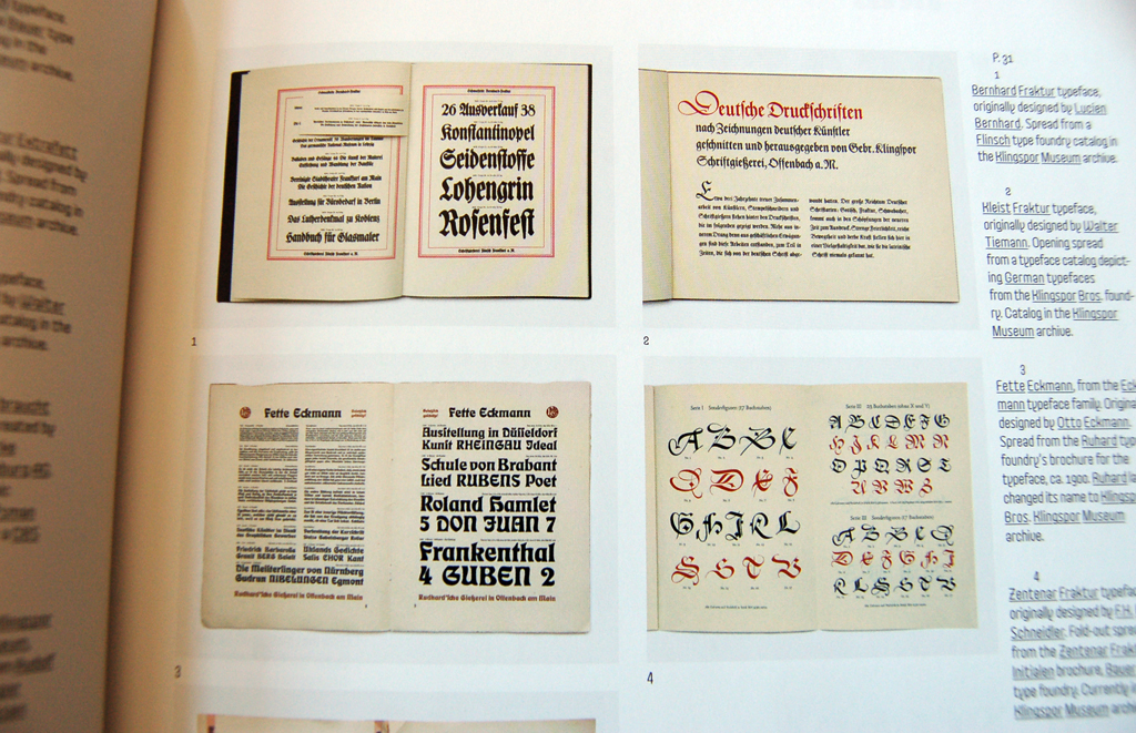
Of the 214 available images, I chose to have thirty-three reproduced in the issue. I grouped those into the following categories:
- Photographs that would look great if printed at full-page size
- Photographs of sketches or production drawings for Karlgeorg Hoefer’s Notre Dame typeface (Linotype, 1991)
- Miscellaneous sheets of paper from the Linotype archive, most of which were without attribution
- Photographs of miscellaneous Fraktur typeface specimen from 20th century Frankfurt am Main foundries
- Photographs of Fraktur typeface specimen that depicted letters which were particularly ornamented
- Photographs that showed the process of blackletter typeface designs in progress (other than for Notre Dame)
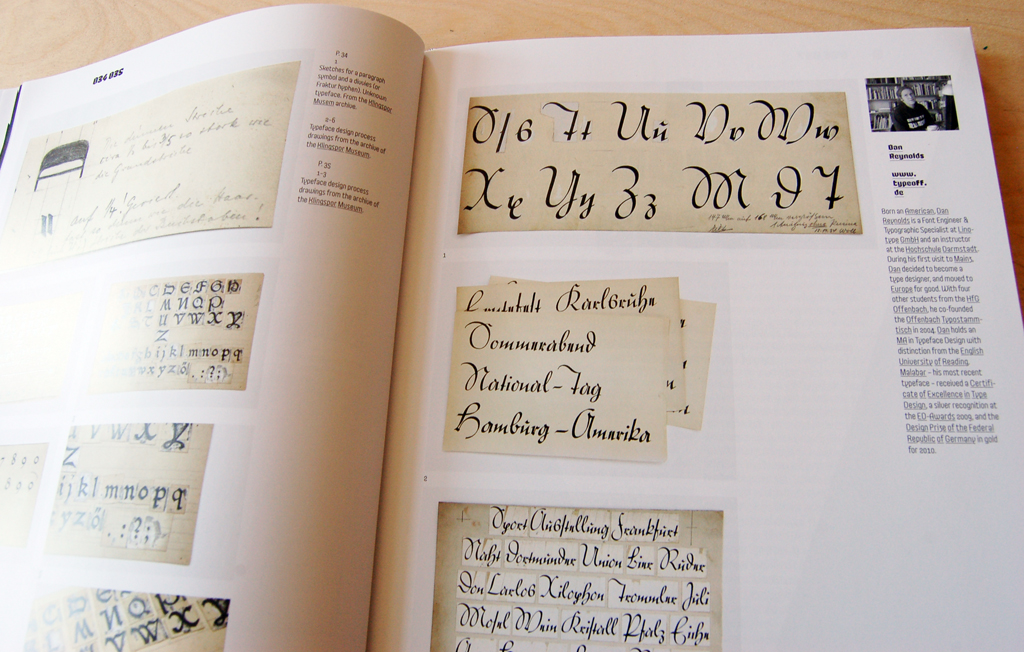
In the spread above (pages 34–35 of the magazine) are nine drawings from at least two typefaces. These are not production drawings, but design-in-process drawings. They are housed in the library of the Klingspor Museum in Offenbach.
Wilhelm Klingspor Gotisch
Today, Wilhelm Klingspor Gotisch is a difficult typeface. Or rather, it is a difficult font. As reported by Paul Shaw on his blog, the original metal types issued by the Klingspor foundry included both standard-width and narrow versions for each uppercase letter, alternate versions for at least nine of the lowercase, and 35 ligatures. The inclusion of these sorts allowed the setting of more even blocks of text. Of course, the digital font offers few of these possibilities. The digital font is available in just one size: display. Naturally, it is scalable, but it cannot be scaled below a certain point size and not break apart. None of the alternate width characters available, although Linotype’s OpenType version does include some of the ligatures. Again, Paul Shaw writes about the digital font translation’s shortcomings.
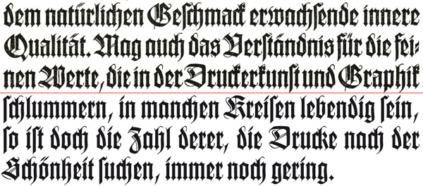
The top three lines of text are set in a metal font of Wilhelm Klingspor Gotisch, as issued by the Klingspor Bros. type foundry in the 1920s. I do not know the point size, but the height of the lowercase letters is approximately 5mm, and the uppercase approximately 7mm. The bottom three lines are set in Linotype’s OpenType Wilhelm Klingspor Gotisch font. Note the different forms of the “k” in each version.
The Wilhelm Klingspor Gotisch types were originally produced in a number of optical sizes. The pilot size was cut in soft-metal patrices by Gustav Eichenauer. Rudolf Koch’s design for Klingspor was not intended for display sizes alone; there are text fonts as well. The difference between the larger and smaller sizes is a triumph of minimalism. The smaller sizes clearly belong to the large ones, yet they appear totally different in their forms. According to Karl Klingspor in Über Schönheit von Schrift und Druck:
Otto Hupp created his solemn, beautiful Liturgisch on a Gothic script basis by relying on the good practices of old: simplifying the rich forms of the large sizes into the smaller ones, rather than to mechanically reduce, which would have the same effect as compressing the rich structure of a cathedral into a building the size of a chapel. Even in typefaces that were created later, like the Wilhelm Klingspor Schrift, such simplification for the small sizes was applied again with success.
Tim Ahrens, in Size-specific adjustments to type design, reports that Wilhlem Klingspor Gotisch was produced for the following point sizes: 9, 10, 12, 14, 16, 20, 24, and 48. In Über Schönheit von Schrift und Druck, there is a 60 pt showing.
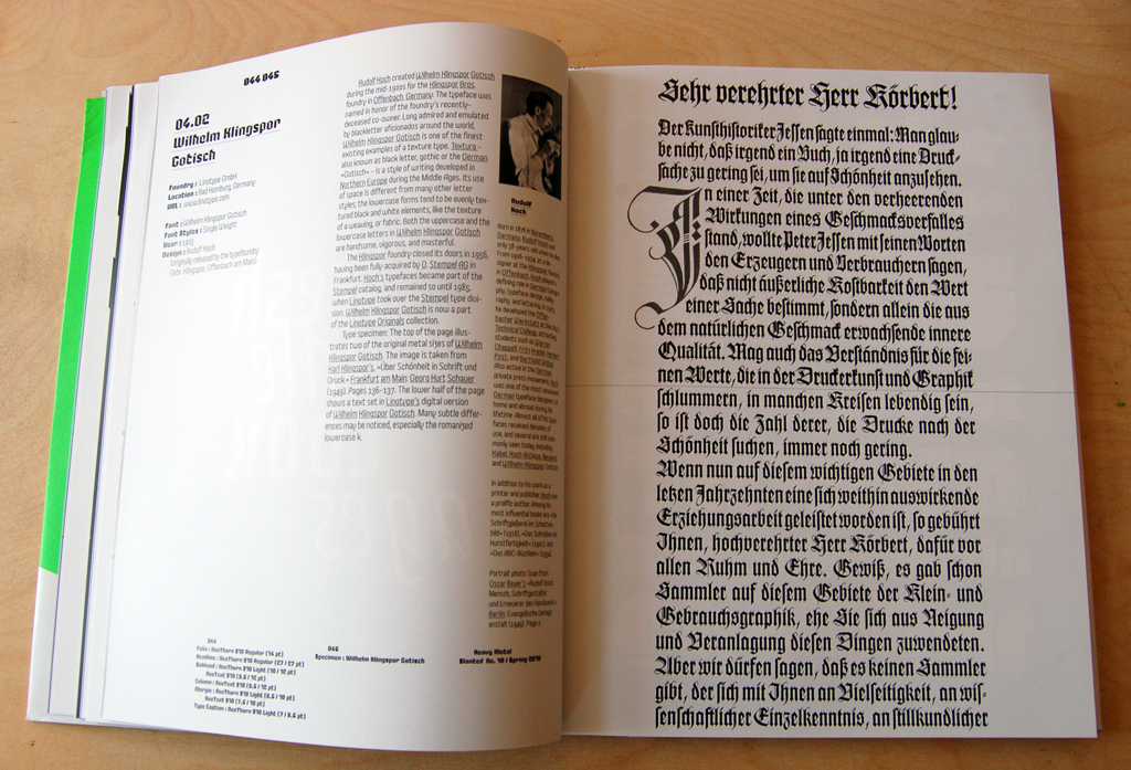
So, what is a specimen maker to do? Slanted clearly wanted to show Wilhelm Klingspor Gotisch as a typeface designed by Rudolf Koch (which it is), and as their specimen pages focus on a design itself first, the designer second, and the respective foundries third. I was sorely tempted just to scan in a page of the type set in metal and write, “There, this is Wilhelm Klingspor Gotisch as it was and always should be!” In the end, I met my inner demons half way. I scanned in page a showing of the metal type from page 136 of Über Schönheit von Schrift und Druck. After 12 lines, I drew a thin rule, and continued with the image’s text, now set in Linotype’s current OpenType font. Sure, our font does not look too shabby! Whoever digitized this back in the 1980s did a wonderful job with the outlines. But the lack of the alternate-width characters is clearly visible; the text on the lower-half of the page does not fit together nearly as well as the top-half.
Malabar advertising
The Malabar ad on page 13—which is printed brilliantly—was a piece that I spent far less thought on. I think that I laid the page out at around 3am. The layout itself is a retooling of a specimen graphic that I created in July 2008, while I was still a student at Reading. I included the standard Linotype footer at the bottom of the ad, but I doubt somehow that the ad itself adheres to our current corporate design guidelines.
Other things I particularly like
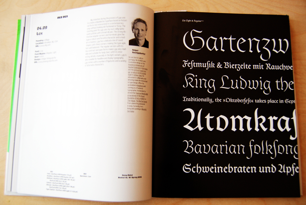
As I alluded to earlier, this issue is filled with things that really delight me. As an avid follower of blackletter projects (stalker might be a better description…), I was already familiar with a lot of the material in this Spring’s Slanted. One typeface that I hadn’t seen before, but which particularly stuck be, was Lex, which looks quite excellent. Lex comes from Holger Königsdorfer, a graduate of the type]media course at the Royal Academy in The Hague.
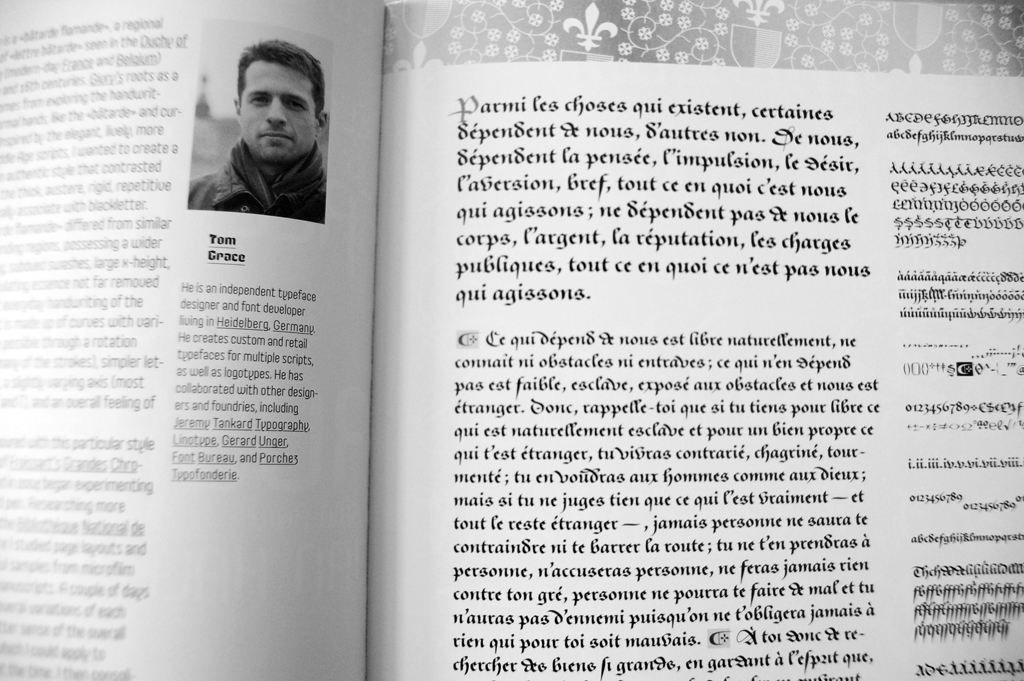
It was also a pleasure to see Tom Grace’s Givry in the magazine. Distributed through TypeTogether, Givry is a bâtarde flamande. I am quite a fan of the design; it was my pick for Typographica’s Best Fonts of 2008 article.
I’ve included this photo as a stand-in for all of the other spreads that I would like to mention. Photographing them all would make this post far too long, and spoil the reading the magazine itself. The usual suspects are to be found in this issue of Slanted. Aside from blackletter made out stencils, blackletter made out of tape, some of the early work of Jonathan Barnbrook is featured in Slanted as well (particularly the Bastard typeface). It is nice to see all of these threads come together. Of course, the entire strand of digital-era blackletter type design and typography is not included. This would add too much material to the magazine. As a result, there are certain things that I feel are “missing,” like the blackletter typefaces of Miles Newlyn (Sabbath Black and Ferox), information about Peter Bain and Paul Shaw’s 1998 “type and national identity” exhibition at the Cooper Union in New York, Gerrit Noordzij’s Burgundica typeface, or a discussion of Fraktur mon amour (I would particularly welcome a critical article on the book, as all discussion about it seems rather positive).
This issue also contains continuations of the fare common in the pages of Slanted, such as the illustrative “Typo Lyrics” section, and “Font Names Illustrated.” There are also articles and photo-essays on heavy metal music. I have no comments on these articles, as I tend to just skip over them to get to the more typographic sections of the magazine. The end of the magazine reproduces some of the most actively discussed threads from the Slanted.de blog.
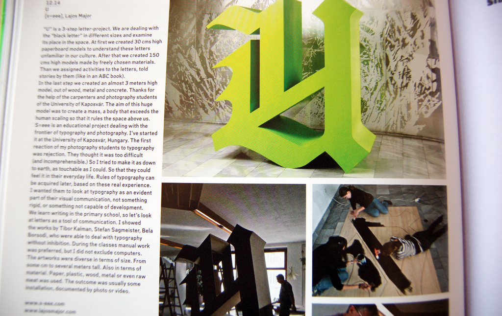
This image is a treat for me. A group of students in Hungary built this three-meter-high capital U. This sculpture would not even fit in my apartment! Nevertheless, I would still like to have it. More information about this project may be found at s-eee.com and lajosmajor.com.
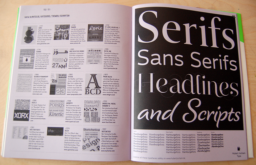
I think that this single page ad from Hubert Jocham Type says all that you really need to know. He makes type, and you can get serif faces, sans serifs, headline fonts, and scripts. Well done!
More about the magazine
Here is what the Slanted editors themselves have to say about the issue:
In “Slanted #10 – Heavy Metal. Lovers.” we look into blackletter fonts and their modern applications. Slanted presents the innovative work of Invisible Creature (Seattle), historic type-treasures from the archives of Linotype (Bad Homburg) and Klingspor Museum (Offenbach), the photo documentation “True Norwegian Black Metal” from Peter Beste (New York) etc. …
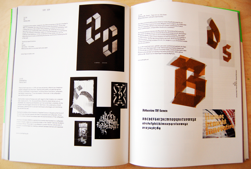
The sections “Fontlabels, Fonts & Families,” “Fontnames Illustrated” and “Typolyrics” introduce contemporary blackletter fonts and designers from all over the world (e.g. Aeronaut/Georg Herold-Wildfellner, SAR-Lupe/David Millhouse, Adso/Bruno Bernard), followed by interviews with Alejandro Paul, Bernard Stein, Alex Trochut and Christophe Szpajdel and an interesting type essay by Horst Wöhrle. Furthermore Slanted Magazine introduces numerous (blackletter-)projects of professionals and students (Jeremy Hall, schmitz & wiesner, s=eee etc.).
This issue completes our 4-part-poster-series and forms now the 4-word-sentence ”Porn 4 Type Lovers.”, a quote from Ivo Gabrowitsch (FontShop International) about Slanted.
If you want to buy the issue via Paypal you get a free access to Slanted portfolio area. There you can present your fresh (typographic) projects or new fonts.
Facts
Slanted Magazine #10
Heavy Metal. Lovers.
Spring 2010
164 pages
Slanted
Frequency: 4 p.a. (Spring, Summer, Autumn, Winter)
Print: E&B Engelhardt and Bauer, Karlsruhe, Germany
Print run: 10.000
Distribution: Directly at www.slanted.de/shop
Advertisements: www.slanted.de/mediadaten
Bibliography
- Ahrens, Tim, Size-specific adjustments to type design. New York: Mark Batty Publisher (2008). Page 165. [Publisher’s link].
- Klingspor, Karl, Über Schönheit von Schrift und Druck. Frankfurt am Main: Georg Kurt Schauer (1949). Pages 23–24 and 136–137.
- Slanted, 2D3D. 4., issue 8. Karlsruhe, Germany (Summer 2009).
- Slanted, Heavy Metal. Lovers., issue 10. Karlsruhe, Germany (Spring 2010).
Notes
In English texts, I refer to the Gebrüder Klingspor Schriftgießerei, Offenbach am Main, as the “Klingspor Bros.” As their Wilhelm-Klingspor-Schrift is now distributed in digital form under the name “Wilhelm Klingspor Gotisch,” I use this name to refer to the original metal release as well.