On Thursday, March 19, 2009, I conducted a day-long logo design workshop with Franck Jalleau and Jean-Baptiste Levée at the École Estienne in Paris. This workshop was part of a numbers of events in the Linotype–École Estienne Platinum Paris 2009 series. Among many other things, the École Estienne seems to be the address to go if you are French and you want to study type design, typography, or typographic graphic design at the undergraduate level. Over the past few years, I’ve had the privilege to get to know a number of school’s graduates, and even work with a few of them professionally. Linotype’s events with the school continue later this week.
The workshop
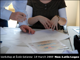
The theme of our workshop was the creation of Latin script companions to existing logos designed in non-Latin scripts, e.g., Arabic, Devanagari, or Kanji. Twelve students from the school’s DMA Typographisme course participated. Luckily, all of us were able to arrive at the campus on time, despite the double-whammy of a national strike and beautiful spring-like weather outside.
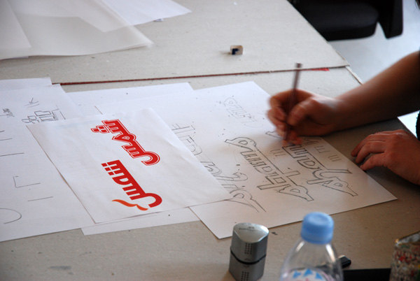
All too often, we see poorly adapted non-Latin localizations of Latin logos, i.e., an Arabic version of a Western department store chain. Many of these logos are made by designers not familiar with the script they are working in. How would the results look if the tables were turned? All of the Estienne students were native readers of the Latin script. If they interpreted foreign logos into their own script, would the results turn out better? The participants began the workshop by choosing a logo from a prepared selection of examples. Then they went to work examining its form with pencils and tracing paper. They soon moved on to the next step, drawing new letters on paper with pencils, pens, markers, and broad nibs.
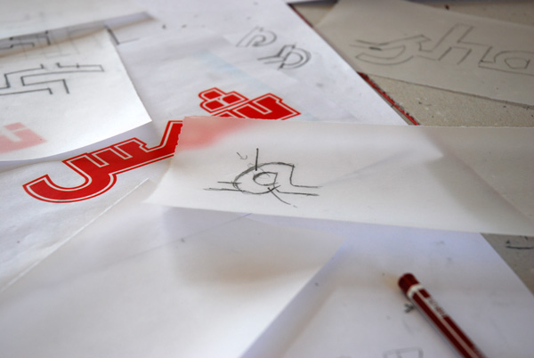
Non-Latin character elements can be interpreted with the Latin script without resorting to parody. For instance, Latin has no equivalent of the Arabic kashida, but there is no reason why the horizontal elements of certain letters could not be elongated to create a specific effect in a piece of of lettering. This is a thoughtful reference to Arabic, whereas writing Latin letters with an “Arab style” brushstroke is not. In the same manner, many north Indian scripts are characterized by their inclusion of a “headline.” But the way to create a companion Latin for a Devanagari logo is probably not to draw a line across the top of all the letters. This is a simple matter of avoiding clichés, like the letters often used on Chinese restaurant menus.
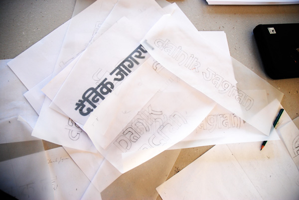
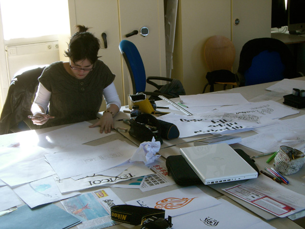
Many students investigated the strokes of their non-Latin script logo’s letters. Once they understood the stroke model, they attempted to port this over to several Latin letters. Other students drew letters in the same typographic style of the original letter (e.g., a monolinear sans serif), without directly reproducing the stroke pattern. Especially those students working with Kanji forms attempted to look at the character shape structure and overall color, rather than stroke pattern itself.
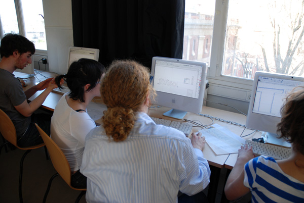
Later in the day, students scanned in their final drawings, and then placed these images in the background layer of FontLab Studio. Fortunately, all of the students already had exposure to working in FontLab, and where able to vectorize their concepts quite quickly. The resulting work was printed out and compared with the original-script logo. If participants were able to learn about the similarities and differences between strokes and letterforms across multiple scripts, then the workshop may be judged as successful.
More images

Unfortunately, I haven’t any French to speak of. Jean-Baptiste Levée worked as my interpreter for the day, performing an invaluable service. I cannot image the workshop having run so smoothly without his assistance. Since Jean Baptiste was also the man behind the camera all day, he isn’t in any of these pictures.
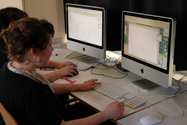
I was pleasantly surprised by the skill that the students already had in FontLab Studio 5. I barely touched Fontographer as an undergraduate (back in those days, I think that FontLab was still a PC-only product). If only I would have been able to draw curves this well when I was a student…
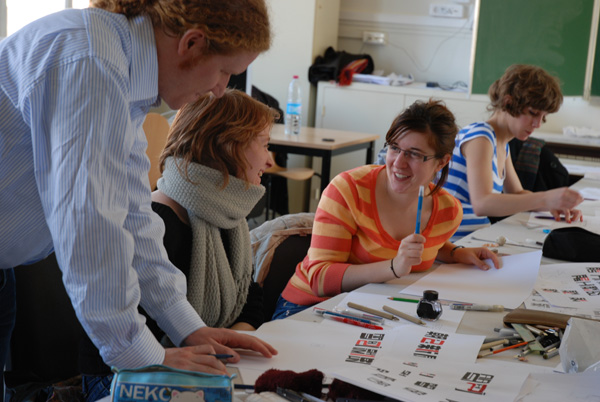
Of course, their skills were not limited to FontLab Studio. Students worked with a number of analogue tools as well. Aside from the pencils and tracing paper that I suggested at the workshop’s outset, several students worked with markers and broad nib pens, too.
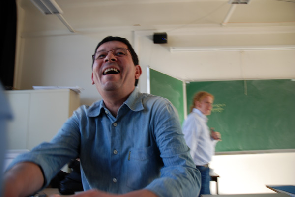
Franck Jalleau in the foreground, and me in the background.
Before and after the workshop
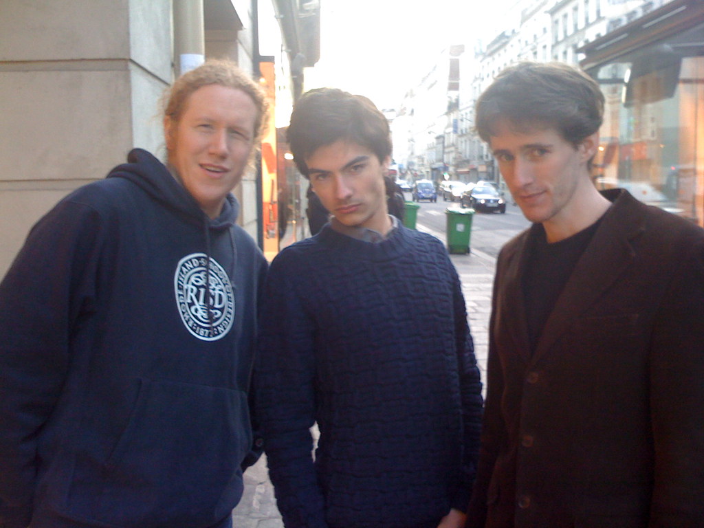
Here I pose with two other TDC2 2009 prize-recipients: Mathieu Réguer and Jonathan Perez. Sorry about the image quality, folks… this is just an iPhone snapshot.
The cusp of Spring turned out to be the perfect time to visit Paris. Although not my first time there, I had never been surrounded by so much typographic goodness. On the night before the workshop, I attended a salon hosted by five designers in their collective working space (one of them was Jean-Baptiste). After the workshop, I payed a long-overdue visit to the don of French type designers, Jean François Porchez. I even received an invitation to a special screening of a film about the Imprimerie Nationale. It was 50 minutes long, without subtitles. But I thought that at least the score and the images were beautiful.
Mathieu Réguer, one of my classmates from the MATD Reading class of 2008, also lives and works in Paris. Spending a few days with him, I had the opportunity to meet all of the Gogotypes, save one, as well as Jonathan Perez (pictured above), who also won a Certificate of Excellence in Type Design at the TDC² 2009 competition this year for Copte Scripte.
I’ll be in Paris again from April 9–11. Aside from slightly warmer weather, I don’t know what to expect yet, though.