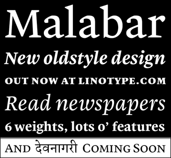
Malabar™ is a new type family for extensive text available at Linotype.com. This study oldstyle serif face currently includes six fonts for the Latin script. The family grew out of Martel, a multi-script project that I created on the MA Typeface Design course at the University of Reading in 2008. Malabar received a Certificate of Excellence in Type Design at the Type Directors Club of New York TDC² competition in 2009, a silver recognition at the ED-Awards 20009, the Design Prize of the Federal Republic of Germany in gold for 2010, and first place in the type design category of Design Austria’s Joseph Binder Award 2010 competition.
Today’s release includes the following fonts:
A Devanagari extension is underway, and will be released at a later date.
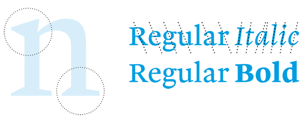
A strong diagonal axis is apparent within the curves of Malabar’s letterforms. Sturdy serifs help strengthen the line of text in small point sizes, as well as define the overall feeling of the face. Malabar’s x-height is very high, a deliberate choice that make the most important parts of lowercase letters visibly larger in tiny text. The height of the capital letters is also rather diminutive, allowing for better character fit as well as eliminating a bit of clumsiness in German typesetting. As an oldstyle design, the Malabar’s Roman, or Regular weight, was informed both by contemporary ideas of typeface design (sheared terminals, the wider-drawn s) as well as by 16th-century masters. True to form, the design of the Italic references old types, as well as current needs. The slopes in the Italics begin at 9°. The Roman’s wedge serifs become more slab-ish in nature as the letters’ weight increases. Malabar Heavy is best relegated to headline use only. Malabar Bold and Bold Italic may be used for text emphasis, a job for which the Heavies are too dark.
Malabar Heavy and Malabar Regular.
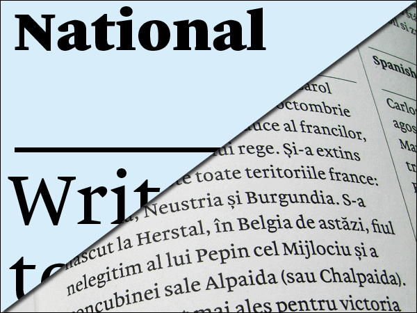
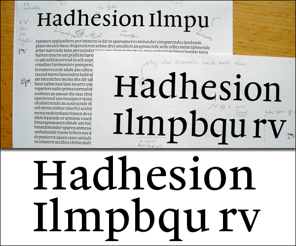
Over the course of the year, I had the opportunity to discuss my progress with a few designers not attached to the MATD course. During TYPO-Berlin 2008, Henning Krause looked over my test sheets. He drew a box around the top right corner of one page with a mock newspaper layout. ‘This is your typeface.’ He was correct; the Malabar typeface is intended for newspapers, makes use of simple, direct forms, and has high contrast between its different weights.
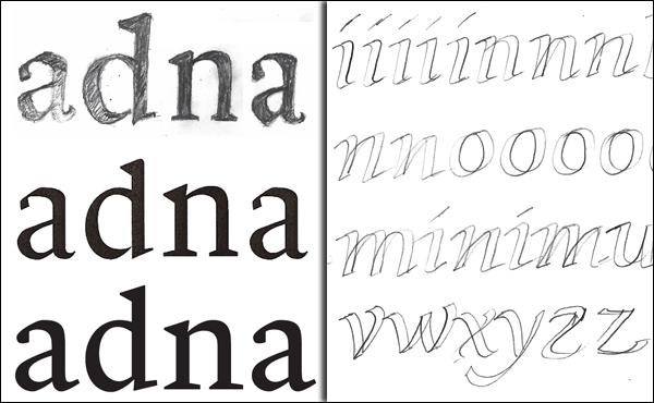
Left (from top to bottom): Sketch made while observing baroque letters from the C. Zincken foundry, Leipzig 1743, shown at 50% actual size; first version of Malabar (November 2007); the current version (July 2008). Right: The first sketches for Malabar Italic.
Before beginning on Malabar, I devoted several weeks to making pencil sketches of type and letters. Thanks to James Mosley’s lectures on Renaissance type at Reading, I also began reading Harry Carter’s A view of early typography up to about 1600. Along with Counterpunch, this focused my attention on the work of Hendrik van den Keere.
At Gerard Unger’s behest, I followed up my investigations into Van den Keere by looking at later baroque types – specifically at the work of Miklós Tótfalusi Kis and the Leipzig typefounders who acquired it. As I translated pencil sketches made while observing these letters into vector outlines, I attempted to open up the interiors a bit, as I felt that the ‘a’, for instance, would otherwise become too dark. While my typeface eventually strayed away from this baroque origin, I tried to maintain a certain ‘baroque sparkle’, which I defined as a specific thick/thin contrast in the letters a and n, for example.
Above, an early test of the letters’ contrast, serifs, and x-height. Below, the final design.
While the forms of Malabar’s serifs were arrived at more arbitrarily than the terminals, they underwent changes as well. Malabar’s lowercase letters have two sorts of serifs: those on the tops—at the x-height or on the ascender—and those on the bottom—on the baseline and beneath the descenders. The upper serifs are triangular and flag-like. The lower serifs are wedge serifs, and are asymmetrical. The left side of the lower serif has a steeper angle than the right. The general impression of these serifs, especially when viewed in larger point sizes, is that they are simple—perhaps even primitive. However, the directness of the serif treatment is rooted in the purpose of the typeface: small-sized newspaper printing. In tiny text sizes, serifs become so small that fine modeling treatments appear no different from wedges like those used in Malabar; depending on the printing quality employed, fine serifs may break apart all together. Malabar’s serifs were developed to avoid this problem. As for modelled serifs that may be appreciated in larger sizes only, Malabar is not timid; its sharp, direct serifs are a clear feature of its DNA.
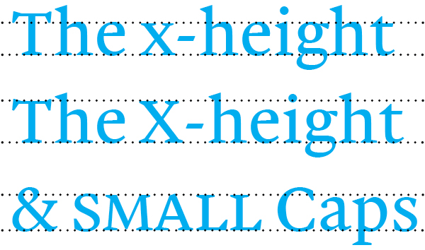
The Roman has three cases: Uppercase, lowercase, and also the small caps. All three should work together in any combination. Well, almost any combination.
After I had reached a certain level of satisfaction with the progress of Malabar’s lowercase letters, I moved on to other areas of the typeface. The next element I undertook were the small caps. Like many MATD students, I heeded advice from Gerry Leonidas and designed my small caps before moving on to the uppercase. Small caps and uppercase letters are—generally—related; small caps may have somewhat wider proportions than the uppercase, and their height is certainly shorter, but they otherwise do not often deviate significantly in their forms from uppercase letters.
It falls to reason that, when confronted with uppercase and small cap letters, a designer may just as easily begin with the uppercase. On this route, one may run into trouble in a few spots that are quite tight; the apexes in the small cap m are very narrow, for example. The amount of white space needed in a capital M is different. By following an ‘uppercase’ model when designing this small cap, the result could be too dark.
My overall typeface proportions only allow for 149 units of space between the x-height and the cap height, which does not leave much choice for the small caps. Since newspapers are documents often read in haste, it was important to me that my small caps be larger than my lowercase letters, so that they would each be easily distinguishable from one another. My small cap height is 578 units—47 units above the x-height and 102 units below the cap height.This gives the small caps the appearance of being optically in between the height of the upper and lowercase letters.
The stroke thickness of Malabar’s small caps is only four units more than that of the lowercase (109 vs. 105 upm). This helps the small caps blend in to the overall colour of lowercase text. While capital letters typically begin words or sentences, small caps may occur in long sequences within a line, and should not appear darker or jarring in relation to the lowercase letters around them. Malabar’s uppercase letters have a stroke thickness of 115 upm, making them not too much heavier than the small caps, but still slightly darker when they proceed lowercase letters.
While Malabar’s small caps and uppercase letters tend to use the same basic forms, there are a few exceptions, notably P and R. Although small caps are by definition ‘smaller’ uppercase letters, in text setting they appear together more often with the lowercase, and it may be desirable to lowercase-ify them in order for these to work together better. In essence, ideal small caps create a third case that takes elements from each of the other two.

On the left, an n from Malabar Heavy’s first draft; via simple expansion of the stems, bolder letters may quickly be generated. On the right, the n’s from the current versions of Malabar Regular, Bold, and Heavy overlap each other.
Aside from Malabar’s Bold and Heavy letters being darker and wider than the Regular, their x-height was taller and the overshoots were larger. The stroke contrast also increases as the family picks up weight. Between Regular and Heavy, the letters’ thin strokes change less than the thicks.
Compared with the Heavy, Malabar Bold is about 61 percent bolder than the Regular. It lies along the MultipleMaster weight axis I worked with while designing the family. In the Heavy master, Malabar’s serifs are more slab-like. As a result, Martel Bold’s serifs are at about a halfway point between the Regular’s wedges and the Heavy’s slab serifs.
Malabar Bold, Bold Italic, Heavy, and Heavy Italic do not have small caps or oldstyle figures, just lining figures. But they do share the same ligatures as Martel Regular, and have full sets of superior and inferior numerals.
Malabar Heavy Italic was the last part of the family that I designed. Although it came at the end of a long process, I do have a warm feeling about it. It is also surprisingly sophisticated. Like Malabar Bold, Malabar Bold Italic was interpolated from the Italic and the Heavy Italic’s forms.
The design of Malabar’s Italic references old types, as well as current needs. Its slopes begins at 9°—Malabar Heavy Italic has a 12° angle. The uppercase letters, as well as the figures of the Italic family members, are more or less sloped romans. But the lowercase letters are much more cursive. Instead of serifs, their letters make use of clear in and out strokes. These feel like Malabar serifs anyway, since they are also long and sharp in their form.
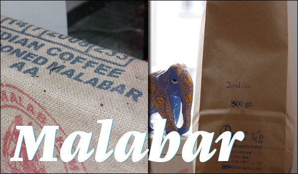
Malabar is most likely the first typeface in the Linotype library named after a brew of coffee. After returning to Berlin from Reading, I spent a few additional months finishing up this typeface for its release. The nearest coffee shop to my apartment is Barcomi’s, in Kreuzberg’s Bergmann Straße. Quaffing copious amounts of India Monsooned Malabar was the balm I needed to complete these character sets.
Malabar is a trademark of Linotype GmbH and may be registered in certain jurisdictions.