![]()
The sixth issue of slanted magazine has been released at the German bookfair in Frankfurt, Germnay. For the first time the award-winning typography magazine has been issued in offset. We could upgrade the previously recognized type- and image-quality of slanted – our partner E & B Engelhardt and Bauer is one of the most high-performance offset-printers in Germany. With this issue we also changed the publication frequency. Henceforth slanted will be released quarterly, 4 times per year with a new fresh topic each time. You can buy the slanted magazine by an advantageous subscription now (www.slanted.de/abo)!
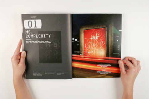
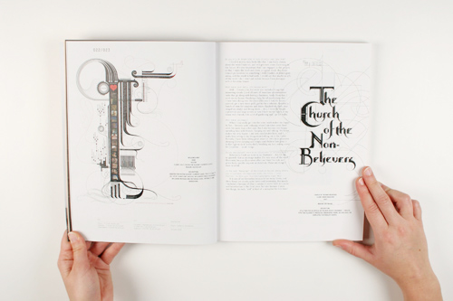
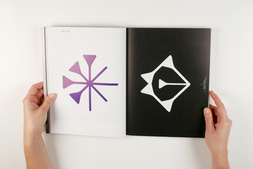
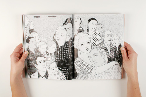
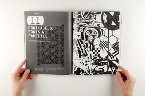
The current issue focalises on signs, symbols and ornaments. In our first magazine section we illuminate the topic by articles, visual essays, portraits of fontlabels and typedesigners, photographic sector as well as in our captions “Fontnames Illustrated” and “Typolyrics”. With contributions of Marian Bantjes (she also designed the current cover), Prof. Johannes Bergerhausen, Typosition, Romibello and many more. The second magazine section offers interesting interviews (among others Hubert Jocham, PetPunk, Kurt Weidemann, Raban Ruddigkeit und Jan Middendorp), a portrait of the Druckkunstmuseum Leipzig (museum for print-art), (final-)works of students and other typestories. The third magazine sector connects the magazine with our weblog www.slanted.de. Here you can find often discussed entries, reader’s response and presentations of new fonts, books and magazines.
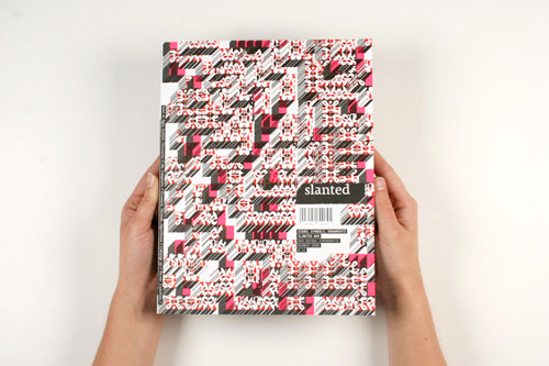
slanted magazine #6
Signs, Symbols, Ornaments
Autumn 2008
196 pages
12 Euro
Get your own copy here: www.slanted.de
SLANTED is all about typography – a topic that is given far too little coverage in German magazines. The magazine is supplemented by the blog on www.slanted.de , which exists since 2004. This Internet platform provides daily updates on typography, design, illustration and photography, while the magazine goes into greater depth and immortalises the topics. Each issue focuses on a different topic. The look and layout of the magazine reflect the (specific) topic of that issue. Issue 4, for instance, is dedicated to matrix and pixel fonts, issue 5 focuses on modern antiquas fonts with serifs. The first part of the magazine presents a variety of aspects including font labels and font design tools, has illustrations of font names, and topically relevant song lyrics transformed into “typolyrics” using appropriate fonts. The second part of the magazine is general, including interviews, studies, typostories etc., while the third part of the magazine ties in to the blog.