Sample font-selling concepts by Frank Grießhammer for Kiosk Fonts.
Since I’ve only been in Berlin sporadically during the past two years, last night was only my second visit to their Typostammtisch. A semi-regular—almost bi-monthly—gathering of type heavyweights, the event is marvelously organized by FSI’s new marketing director, Ivo Gabrowitsch. The Berlin Typostammtisch is much larger affair than our similarly-named Offenbach institution, but this can only be expected when you compare the size of the Berlin design community with that of the Rhein–Main region.
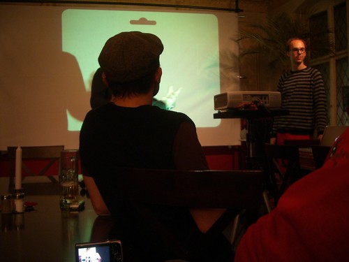
November’s meeting took place last night in Max und Moritz, which I’ve been told has some of the city’s most authentic local cuisine; I don’t know if the celery schnitzel I ate was a Berlin speciality or not, but it was definitely delicious. The evening’s discussion and entertainment was provided by Frank Grießhammer, who provided a brief but excellent presentation of his graduation project, Kiosk Fonts. I was particularly interested by his ideas; he came to this theme because, like many a design school student, he had a hard drive full of student-made fonts, and hadn’t an idea what to do with them, or how to show them to the world. In and of itself, this is not a new idea. Already this year, we’ve seen the advent of Avoid Red Arrows, a student collective/font platform from the University of Arts and Design in Karlsruhe. Older groups also abound online, like the French Gogotype, which still blogs more than a year and half after all of its student members graduated. (Even the first version of TypeOff.de hoped to go in a similar direction, but we failed miserably.)
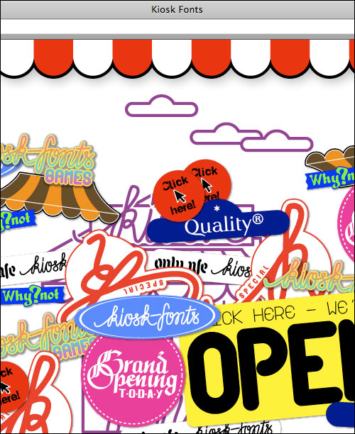
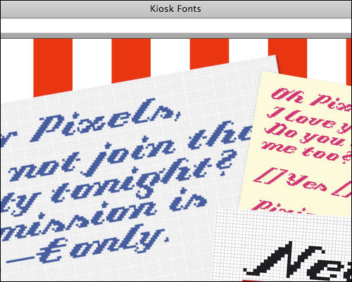
A bit of the Kiosk Fonts website.
What sets Frank and his work apart from other recent attempts are the innovative concepts he envisioned for displaying and promoting typeface designs he and his fellow students created. Aside from the uniquely-built click-through navigation scheme of their website, Frank presented a number of promo schwag showing his fonts in use.
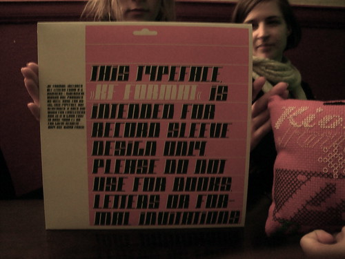
The type in use on this record cover is called Format, a high-contrast face by Frank. During his presentation, Frank mentioned that he only designed this typeface for use on record covers. If that is the case, then there could not be a better way to show it off, no?
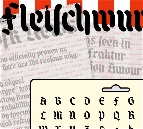
So, Blackletter is seen as (rightly or wrongly!) as a typically-German thing. So are sausages. What is a designer to do? That’s right… a sausage blackletter. Word up.
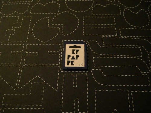
Distributing fonts on a SD card is another neat idea I’ve not seen before. Floppies of all sizes, CD-ROMs, DVDs, zip-drive disks, ok! But this is the first font SD card I’ve come across. The design on the cardboard sheet behind it called Pappe, avery bold randomizer face with alternate characters for almost every glyph… just like what would happen if you would cut each letter out with scissors.
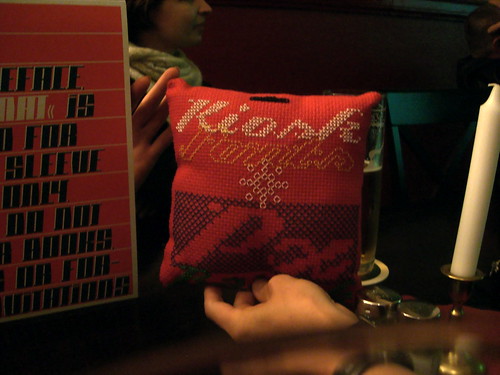
PX Barok is the same design that you can see needlepoint-stitched into the pillow seen in the image at the very top of this post.
As for Frank himself (pictured above), he seems to be doing a good job even when he is not presenting his work at Typostammtische. He graduated from the HBK Saar over the summer, and is working on a script font release for Linotype. Recently, he moved to Berlin to begin an internship at FSI FontShop International.
I believe that the next Berlin Typostammtisch is scheduled for January. After Frank and his Kiosks Fonts, I can’t wait to see what will be presented next!