On Thursday, September 7, I visited the opening of the Berthold Wolpe exhibition at the Gutenberg Museum in Mainz. In another post last week, I touched briefly on Berthold Wolpe’s career, as well as the digital version of his Albertus typeface. This article covers the Mainz exhibition more directly.
The opening began with an introductory talk by Susan Shaw from the Type Archive in London. She would pause every few sentences for Dr. Eva Maria Hanebutt-Benz, the director of the Gutenberg Museum, to translate into German. Afterwards, Jost Hochuli (St. Gallen, CH) gave a slide presentation that delved a bit deeper and more anecdotally into the life of Berthold Wolpe than the exhibition itself did. Hochuli knew Wolpe for many years, particularly through the annual conferences of the ATypI.
The show itself is housed inside a large, single-room basement gallery inside the Gutenberg Museum’s newer building. Pieces were on loan from the Type Museum and Faber & Faber in London, as well as from the Klingspor Museum in Offenbach. An exhibition catalog, a 2005 reprint of the catalog from Wolpe’s 1980 retrospective at the V&A, is on sale for 18 Euros. A poster showing a number of Wolpe’s book jackets for Faber & Faber is also on sale in the museum shop.
I found a number of small elements in the exhibition—as well as in Berthold Wolpe’s life and career—both interesting and inspiring. Here they are, as recollections and photographs of the exhibition.
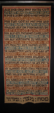
Rudolf Koch and the Offenbacher Werkstatt. As a member of Rudolf Koch’s circle, Wolpe was involved in the 1927 Offenbacher Haggadah for Siegfried Guggenheim. While the book itself is set in Koch’s Jessen typeface, the Hebrew lettering was created by Wolpe. He was involved in a number of Koch projects, including some editions of the ABC-Büchlein.
Funerary Monuments. Wolpe designed number of gravestones and other tablets, both in Germany and in the UK. Sadly, a number of his German pieces were for Jewish clients, and appear not to have survived. His monumental lettering would go on to inspire his first typeface, however.
From a bookcover designed by Berthold Wolpe. This looks like a Cyrillic addition to his Albertus typeface!
Albertus. During a visit to London in 1932, Stanley Morison asked Wolpe to adapt capital lettering from an earlier bronze tablet piece into an alphabet of titling caps. This would become Albertus, first released in 1935. Wolpe added a lowercase in 1937, and light and bold weights in 1940. During his decades-long career as a book designer at Faber & Faber, Wolpe would repeated use Albertus on book jackets, and he set it superbly.
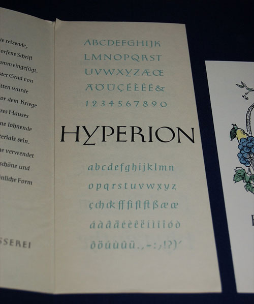
Hyperion brochure, Bauer’sche Schriftgießerei.
Hyperion. Released by Bauer around 1950, was initially cut during the 1930s by Paul Koch, son of Rudolf Koch. Hyperion was also later distributed by Neufville in Barcelona under the name Homero.
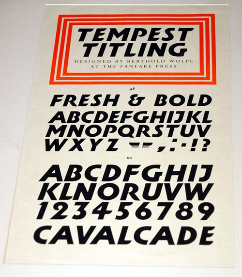
A specimen for Tempest Titling.
Tempest Titling. The most contemporary of his typefaces, in terms of appearances, was probably Tempest Titling, another all-caps display face. This was designed exclusively for the Fanfare Press in 1935, and was cut for Monotype setting in 1936.
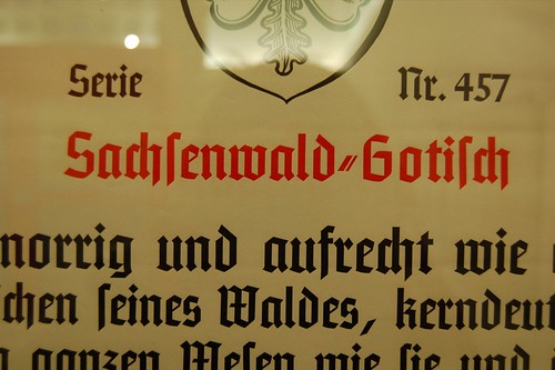
Specimen for Monotype’s Sachsenwald-Gotisch.
Sachsenwald-Gotisch. Of interesting note is Wolpe’s Sachsenwald-Gotisch, a neo-blackletter released by Monotype in 1937. Similar both to the work of Koch’s school as well as other popular German Gotisches from the 1930s, such as National, Element, Tannenberg and Sachsenwald-Gotisch seems to have been made to fill a particular marketing need.
Sachsenwald-Gotisch together with Albertus.
This rigid style of typeface has become associated with nationalist elements in Germany; it is therefore particularly interesting that this typeface, sold in Germany during the National Socialist regime, was designed by an artist who was forced to leave his country after losing his right to work there because of his religious background. Irony, but a perhaps a sweeter variety thereof.
Wolpe was named a Royal Designer for Industry in 1959, and received an honorary doctorate from the Royal College of Art in 1968. He worked continuously through to his death in 1989. The present exhibition will travel onward to the Victoria & Albert museum in London (it will be Wolpe’s second retrospective there) before heading to further potential ports.